What is all the fuss with Sydneys handball game and would it stand up in finals?
Author
Rhys Tribolet
Published
May 14, 2026
Note
TL;DR
Sydney possesses the highest proportion of metres gained through handballs, but how Collingwood defended in round 10 significantly changed this
Sydney are the highest scoring team by total points, but they sit mid table for their scoring source proportions, showing balance in their scoring methods
Historical contested metrics in finals give us further detail to evaluate whether current methods may stand up or not
Firstly, what does Sydney’s handball game look like?
To start off with, it is fast. They have a litany of mids and backs that can run and carry.
Across the competition, metres gained from handballs have gone up from 255m last season to 321m this year. It notes an aggressive gamestyle and relies on numbers committing to the run and carry. If and when teams press defensively, they are trying to use their numbers in a way where there is usually one [attacker] out the back on the end of the handball chain.
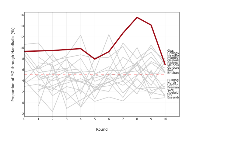
Sydney has the highest proportion of metres gained through handball relative to total metres gained. They have sat above average the whole year but increased quite a lot through rounds 7-9. Their highest proportion came against Melbourne with 15.5%. This was about 10% above the competition average (dashed red line below).
Tip
Hover over the graph to see exact percentages and teams.
Show the code
library(dplyr)library(plotly)library(readr)df2 <-read_csv("Forward HB.csv")league_ave <-mean(df2$hb_metres_percent, na.rm =TRUE)highlight_team <-"Sydney"# Label dataframelabel_df <- df2 %>%filter(!is.na(RoundNumber),!is.na(hb_metres_percent) ) %>%group_by(team_name) %>%slice_max(RoundNumber, n =1) %>%ungroup()# Split non-highlight teamsgrey_teams <- df2 %>%filter(team_name != highlight_team) %>%split(.$team_name)# Create plotp <-plot_ly()# Add non-highlighted teamsfor(i inseq_along(grey_teams)) { team_df <- grey_teams[[i]] %>%filter(!is.na(RoundNumber),!is.na(hb_metres_percent) )# Skip teams with <2 observationsif(nrow(team_df) <2) next p <- p %>%add_lines(data = team_df,x =~RoundNumber,y =~hb_metres_percent,split =~team_name,line =list(color ="rgba(200,200,200,0.9)",width =2 ),hovertemplate =paste0("<b>", unique(team_df$team_name), "</b><br>","Round: %{x}<br>","HB %: %{y:.2f}<extra></extra>" ),showlegend =FALSE )}# Highlight teamhighlight_df <- df2 %>%filter(team_name == highlight_team) %>%filter(!is.na(RoundNumber),!is.na(hb_metres_percent) )if(nrow(highlight_df) >=2) { p <- p %>%add_lines(data = highlight_df,x =~RoundNumber,y =~hb_metres_percent,split =~team_name,line =list(color ="#9E0B16",width =4 ),hovertemplate =paste0("<b>", highlight_team, "</b><br>","Round: %{x}<br>","HB %: %{y:.2f}<extra></extra>" ),showlegend =FALSE )}# Add end labelsp <- p %>%add_text(data = label_df,x =~RoundNumber +0.05,y =~hb_metres_percent,text =~team_name,textposition ="middle right",textfont =list(size =10),hoverinfo ="skip",showlegend =FALSE )# League average linep <- p %>%add_segments(x =min(df2$RoundNumber, na.rm =TRUE),xend =max(df2$RoundNumber, na.rm =TRUE),y = league_ave,yend = league_ave,line =list(color ="red",dash ="dash",width =1 ),inherit =FALSE,showlegend =FALSE,hoverinfo ="skip" )# Layoutp <- p %>%layout(title =list(text =paste0("<b>Proportion of metres gained through handballs relative to total metres gained</b><br>","<sup>Sydney highlighted against league trends by round</sup>" ),x =0,xanchor ="left" ),xaxis =list(title ="Round",tickmode ="array",tickvals =sort(unique(df2$RoundNumber)),showgrid =TRUE,gridcolor ="grey88",zeroline =FALSE ),yaxis =list(title ="Proportion of MG through Handballs (%)",showgrid =TRUE,gridcolor ="grey88",zeroline =FALSE ),plot_bgcolor ="white",paper_bgcolor ="white",font =list(size =10),margin =list(l =80,r =140,t =40,b =80 ),shapes =list(list(type ="rect",xref ="paper",yref ="paper",x0 =0,y0 =0,x1 =1,y1 =1,line =list(color ="black",width =1 ),fillcolor ="rgba(0,0,0,0)" ) ) )p
Note the decline in percentage of total metres gained via handball in round 10 against Collingwood - 6.9% compared to 14.1% the week before. Collingwood deliberately overdefended the corridor and gave them wide options, through kicking. Hence, their metres gained proportion through handball decreased quite drastically.
Whilst the higher proportion of metres gained through handball may be indicative of their transition game and ball movement in general, how has their scoring looked?
How do they score?
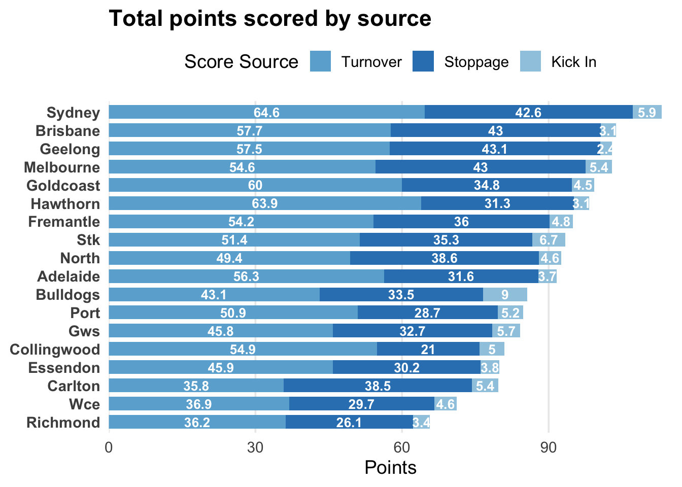
The Swans are scoring the most points in the competition this year, averaging 113.1 points per game. They average 65 points from turnover (1st in the comp), followed by 43 points from stoppage (4th) and 5.9 points from kick ins (3rd).
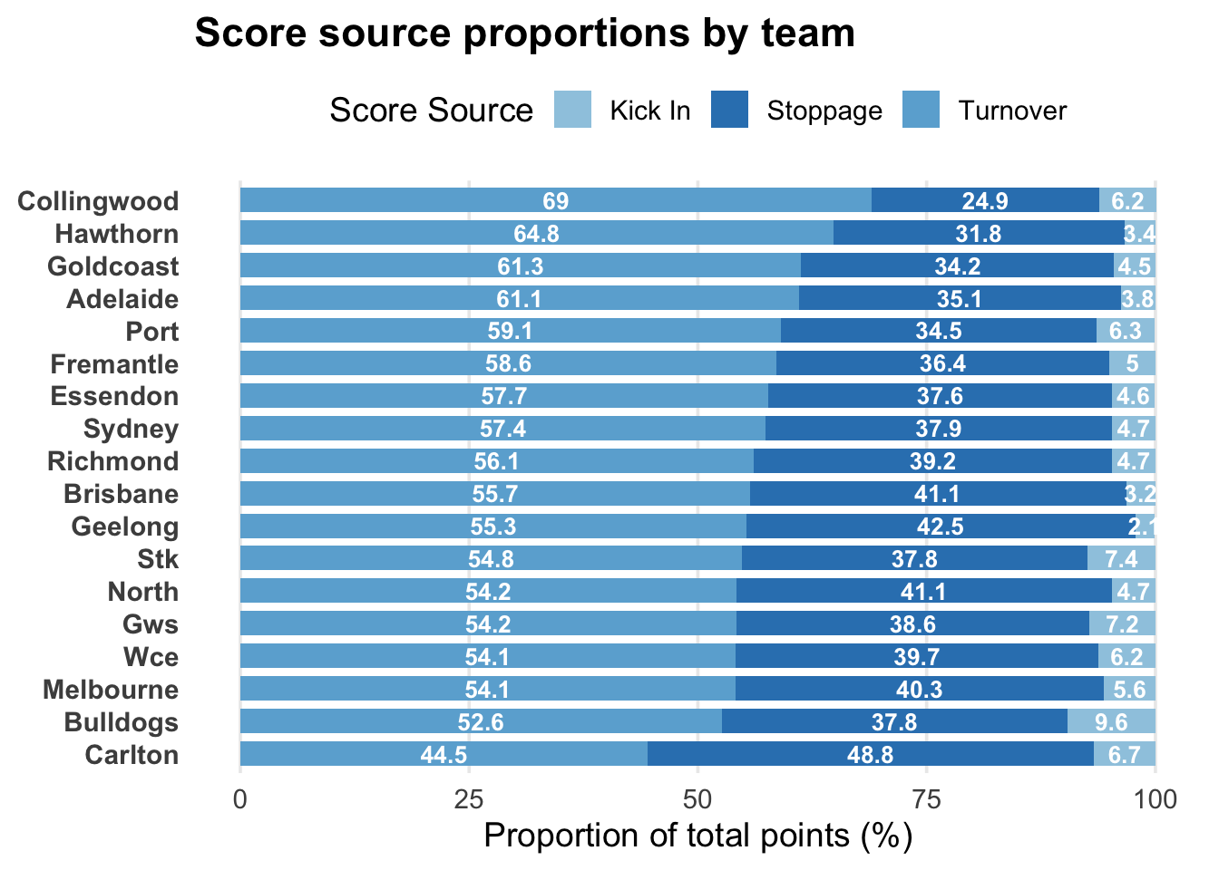
However, they rank 8th for their proportion of scores coming from turnover (57% of total points come from turnover). They rank 9th for their proportion of scores coming from stoppage (38%) whilst ranking 10th for kick in (~5%).
Show the code
library(tidyverse)df_scores_summary <-read.csv("Score proportions.csv")# Convert to long formatdf_long <- df_scores_summary %>%pivot_longer(cols =c( kickin_scores_proportion, turnover_scores_proportion, stoppage_scores_proportion ),names_to ="Score_Source",values_to ="Proportion" ) %>%mutate(Score_Source =recode( Score_Source,kickin_scores_proportion ="Kick In",turnover_scores_proportion ="Turnover",stoppage_scores_proportion ="Stoppage" ),# Order teams by turnover score proportionteam_name =reorder(team_name, Proportion) )# Order teams by total proportionteam_order <- df_long %>%group_by(team_name) %>%summarise(total =sum(Proportion)) %>%arrange(total) %>%pull(team_name)df_long$team_name <-factor( df_long$team_name,levels = team_order)# Order teams by turnover proportionteam_order <- df_scores_summary %>%arrange(turnover_scores_proportion) %>%pull(team_name)df_long$team_name <-factor( df_long$team_name,levels = team_order)# Stacked horizontal bar chartggplot( df_long,aes(x = Proportion,y = team_name,fill = Score_Source )) +geom_col(width =0.75 ) +# Add labels inside barsgeom_text(aes(label =round(Proportion, 1)),position =position_stack(vjust =0.5),size =3.5,colour ="white",fontface ="bold" ) +labs(title ="Score source proportions by team",x ="Proportion of total points (%)",y =NULL,fill ="Score Source" ) +scale_fill_manual(values =c("Kick In"="#9ecae1","Turnover"="#6baed6","Stoppage"="#3182bd" ) ) +theme_minimal(base_size =14) +theme(panel.grid.major.y =element_blank(),panel.grid.minor =element_blank(),legend.position ="top",plot.title =element_text(face ="bold"),axis.text.y =element_text(face ="bold") )
It shows a relatively balanced scoring profile. Consider this in light of how most commentary has spoken about their ball movement and transition out of the back half but haven’t considered their balance of scoring from stoppage.
To read further about all teams scoring sources with more detail, read this article by ABC Writer Cody Atkinson.
Nonetheless, the commentary last week and this week has been about their ball movement and handball game.
Alistair Clarkson mentioned before their round 9 game against the Swans ‘It will be really interesting to see how that [aggressive handballs] is quelled over the journey, over the long term…and particularly in finals, when the heat is really on’.
Josh Jenkins also said ‘I just don’t like the forward handball game’. He continues, ’it looks like a game style that will work very well rounds 1-24… It looks like a game style that under immense and intense pressure, will come unstuck.’
So, let’s take a look at some of their contest metrics.
Do they win their own ball?
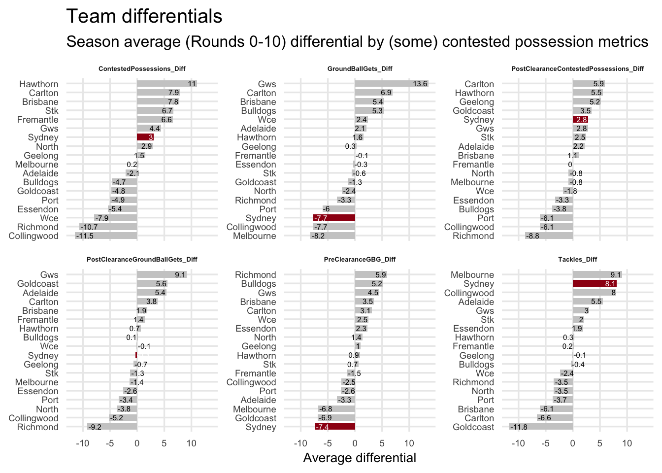
Two answers: Yes and no. It depends on how they win it. The main points here are:
They rank 7th for contested possession differential
16th for groundball get differential
Equal 5th for post-clearance contested possession differential
They breakeven in post-clearance groundball gets, sitting mid table at 10th
They sit 18th for pre-clearance groundball gets
Lastly, they rank 2nd for tackle differential with +8.1 compared to their opposition team (this was +11 before round 10)
It seems they can neutralise contest losses with their spread post the stoppage when the ball clears the area. Further, if they don’t win the ball, they are still sticking tackles.
How do these compare to finals
The insinuation of Clarksons and Jenkins comments were along the lines of …your contest style and winning the ball will be what wins finals footy. Although time will tell this year, what does history tell us about contested footy in finals?
Let’s have a look at the last three seasons of finals games.
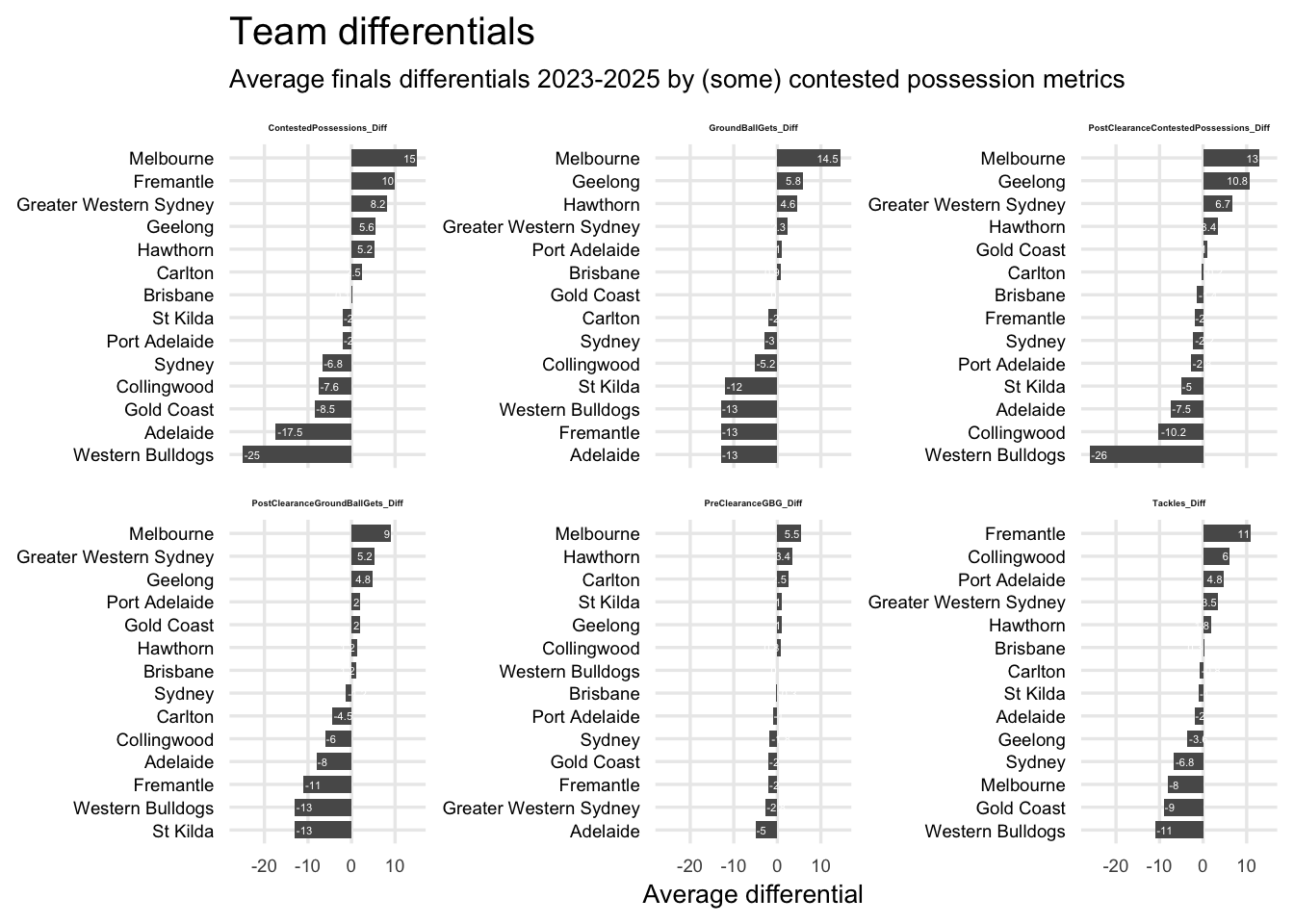
It seems they’re right about contest playing large roles in finals games. With pressure high, winning teams across 2023-2025 finals games largely had positive differentials for most metrics, including tackles. During this period however, there were some pretty high differentials in a handful of games. Take the Bulldogs vs Hawthorn in 2024. The Hawks won with a +25 contested possession differential. Adelaide also came up against the Hawks in the 2025 series and were decimated at the contest, with the Hawks +31 in contested possession.
When we break it down by team across this period, we can see a bit more detail.
Melbourne sit consistently in 1st across all metrics excluding tackle differential.
Geelong sit amongst the top five for most metrics excluding tackles.
As mentioned, the bulldogs were touched up by the Hawks in their one final in this period.
Interestingly, Brisbane sit mid table for each of the metrics and have gone back-to-back.
What to take away?
It does seem finals are a different ballgame when it comes to contest being king. However, some of the games played over the last few years have skewed our interpretation of this.
For now, the aggressive ball movement and transition style are winning games. However, being adaptable and having different ways to play is necessary, as we saw in round 10.
Regardless of the tactics being implemented right now, teams continually evolve as the season plays out. Fortunately for some, finals games aren’t won in May.
Data availability
All of the data used in this article is available at Wheelo Ratings.