library(readxl)
library(tidyverse)
library(ggplot2)
library(lme4)
library(lmerTest)
library(MuMIn)
library(sjPlot)
library(parameters)
library(performance)
library(effectsize)
library(lattice)
library(ggpubr)
library(influence.ME)Building and Interpreting mixed model outputs
Team sport
Data
Statistics
Linear mixed model
Long read (+10 mins)
How to produce summary outputs, fixed and random effect plots and effect sizes for mixed models in R
Continuing on from building a linear mixed model using sports data, we will generate outputs to show a summary of the model, gauge how accurate it is, generate and plot predicted values and determine how baseline values may differ across different players and conditions.
NoteTL;DR
Linear mixed models are powerful. They allow practitioners to analyse repeated or longitudinal sports data while accounting for both fixed (e.g. marks, pass efficiency rates) and random effects (e.g. player and training condition differences)
Good modelling is more than running the model. Checking assumptions, investigating influential datapoints and visualising predictions are critical steps to ensure the results are trustworthy
Mixed models reveal both system and individual effects. Model outputs, such as coefficients, R2 values, predicted plots, random effects and effect sizes, help translate results into insights about which performance variables are associated with our passing network metric whilst accounting for differences between players and training conditions
TipPDF of the article
Read part 1 here: An applied example of a linear mixed model with sport data
Get access to the data here 📄
Estimated reading time: ~10 minutes
A recap of what we know…
This article is part 2 of looking at Linear Mixed Models (LMMs) in sport. The first part can be read here. The first part gives a background to what LMMs are, understanding what fixed and random effects are, what statistical assumptions we must satisfy in the data and how to construct our models using R.
To recap the first article:
LMMs provide a suitable option to analyse repeated or longitudinal datasets in sport
Fixed effects are treated as variables that have a predictable or constant effect across all levels of our analysis, e.g. the effect of heat on perceived exertion
Random effects represent the variability within a particular factor or level, e.g. players or conditions of training
We were explaining a variable called Indegree Importance (Sheehan et al., 2019), which reflects the incoming passing interactions a player has regarding ball movement (a higher number reflects a higher level of importance in the team/network)
Our most appropriate model was:
lmer(indegree ~ marks + handball efficiency + kick efficiency + player numbers + (1|player) + (1|condition)This above model reads as ‘indegree importance as predicted by marks, handball and kick efficiency and player numbers’ whilst characterising for player and condition idiosyncrasies
We will continue from our final model we constructed, where we must firstly check a couple of remaining assumptions. After this, we will assess our model outputs and what that means for how we can use this information in practice.
Assumption checking with our final model
There are a few assumptions we must check to see if our model fits the data:
- Normality of residuals – QQ plots and histogram of residuals
- Homoskedasticity – equal variance in the residuals
IndependenceMulticollinearityLinearity of predictors- Influential datapoints
We have already performed some of these assumption checks before. These include using the mixed model with our specified random error structures to meet the independence assumption, multicollinearity and linearity of predictors. We can now check the other assumptions.
Influential data points
Determining influential datapoints isn’t as simple as identifying the outliers and removing them. And whilst it isn’t as assumption per say, it is important to manage them. If we do not manage them, it could lead to drastic changes when we interpret our results. Specifically, single cases can change the level of significance of an estimate, therefore influencing our ability and confidence to make inferences from the model (Demidenko & Stukel, 2005; Nieuwenhuis et al., 2012).
Cooks distance is used in regression settings to estimate the influence of a datapoint, taking into account both the leverage (influence) and residual (error) of each observation. It is a summary of how much the model changes when the ith observation is removed (Nieuwenhuis et al., 2012; Thieme, 2021).
I will use Cooks distance to identify, investigate and potentially remove influential datapoints. So how do we know what is considered an influential data point? And further, can we remedy their influence somehow, in the form of collecting more data, checking data consistency, or removing the influential points, if necessary.
Firstly, let’s determine each observations respective cooks distance value.
Before that, let’s load the required packages and rename our variables:
ind_df2 <- read_csv("Individual values - R File.csv")
## Rename variables from individual file ----
row_id <- ind_df2$`Row ID`
condition <- ind_df2$`Condition Identifier`
player <- as.factor(ind_df2$`Player ID`)
spp <- ind_df2$`Space per Player`
width <- ind_df2$Width
length <- ind_df2$Length
total_players <- ind_df2$`Total Players`
time <- ind_df2$`Time (Secs)`
indegree <- ind_df2$`Indegree Quotient Score`
outdegree <- ind_df2$`Outdeg Quotient Score`
kick_eff <- ind_df2$`IND Kick %`
goals <- ind_df2$Goals
turnovers <- ind_df2$`NO. OF TURNOVERS`
marks <- ind_df2$Marks
shots <- ind_df2$`NO. SCORING SHOTS`
player_id <- as.factor(ind_df2$`Player ID`)

# make NAs 0 in the handball % column
ind_df2$`IND HB %`[is.na(ind_df2$`IND HB %`)] <- 0
hb_eff <- ind_df2$`IND HB %`

ind_df2$`IND Kick %`[is.na(ind_df2$`IND Kick %`)] <- 0
kick_eff <- ind_df2$`IND Kick %`

options(scipen = 999)

## construct model ----
model6 <- lmer(indegree ~ marks + hb_eff + kick_eff + total_players + (1|player) + (1|condition), REML=FALSE)

# each modelled value has a respective cooks distance value
cooks <- as_tibble(cooks.distance(model6))
cooks_ave <- mean(cooks$value) # mean cooks distance
We now have our dataframe of identified cooks distance values and an average value.
Before we visualise this, what methods can you use to identify influential data points
Distance greater than 1.
This is useful for moderate or large sample sizes (which we do not have)Distance > 4/n.
A sample size adjusted cutoff (this is more sensitive with smaller samples, of which we have here)Distance > 3*mean of cooks distance.
Points are considered relative to the current sample and its distribution.
This method is more widely used in applied work.
Consequently, we will use the last method. We firstly create a dataframe that classifies observations as observe or remove - observations above 3 times the mean are classified as ‘observe’, so we can investigate them. Let’s visualise the cooks distance values and identify the values that are above 3x the average cooks distance value.
cooks_df <- cooks %>%
  mutate(id = as.character(row_number())) %>% # include ID row
  mutate(Above_3_times = ifelse(value > 3*cooks_ave, "Observe", "Keep"))

ggplot(cooks_df, aes(x = rownames(cooks_df), y = value)) +
  geom_point(size = 2.75, shape = 21, fill = "grey50", color = "black") + ylab("Cooks Distance Value") + xlab("Observation Number") +
  geom_hline(yintercept = cooks_ave*3, col = "red") + # 3 times the mean cooks distance
  geom_text(aes(label = if_else(Above_3_times == "Observe", id, "")), vjust = -1, size = 2.5) + # label points above 3*mean
  theme_classic() +
  labs(title = "There are 22 influential observations based on 3*mean of cooks distance",
       subtitle = "Points above the red line are considered influential based on this cutoff") +
  theme(plot.title = element_text(size = 13, face = "bold"),
        plot.subtitle = element_text(colour = "grey50", size = 12),
        axis.title = element_text(size = 12),
        axis.text.y = element_text(size = 12),
        axis.text.x = element_blank(),
        axis.ticks.x = element_blank())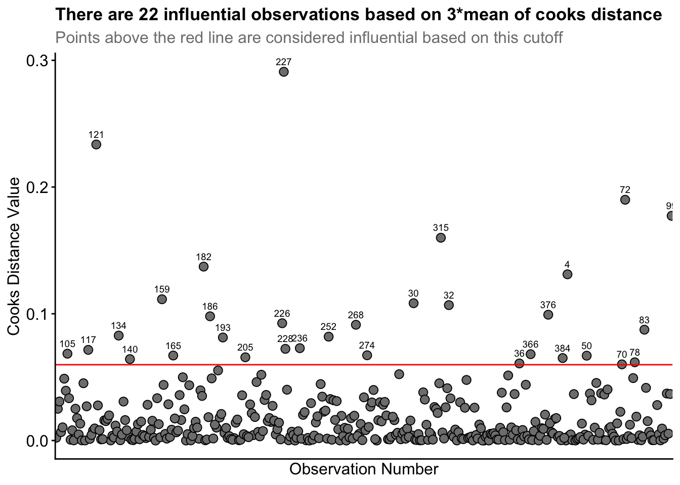
Straight away, you can see the high cooks distance value for row ID 227, and to lesser extents for row IDs 121 and 72.
From this process, 22 observations were identified as being influential based on 3* mean of cooks distance. I observed the data associated with each row ID. I realised Row_ID 227 had Player_ID 53 represented twice. That is, player 53 had two observations for the same drill condition. This likely inflated that players influence in the model. However, this player had simply rotated between two teams within the same drill. So, their data is still accurate. Nonetheless, I investigated the influence of removing this datapoint between our original model and a new model without this datapoint.
There was an increase of ~4 in the AIC value in this new model. So it worsened the model fit, so I retained it. This point indicates influence, not error.
Note
It is important to note that the AIC became higher in the model after I removed the influential datapoint. However, the marginal and conditional R2 values (i.e. values that indicate how much variance in the dataset the model explains) improved, i.e. the model without the influential datapoint now explained more variance. This is normal considering the model is now fit to a) less data and b) it doesn’t have to try explain this hard-to-fit but informative datapoint. We would like our model to predict new data from the same process, so I will favour the AIC metric rather than R2.
Row IDs 121 and 72 both had high cooks distance values, but nothing in the raw data seemed incorrect. Row ID 72 had a much higher than average number of marks taken, but the player seemed to have a comparable number of possessions to justify the 6 marks. The rest of the identified datapoints 3* the cooks distance mean seemed to all be reasonable datapoints with no incorrect inputs or any discernible pattern across them, e.g. the identified influential datapoints contained different players across different conditions etc.
So, our influential data point investigation determined some influential points, but with no pattern or any meaningful reason to remove them, all of our observations remain in our original model.
Now, we can go further into the applicability of this model without needing to go through the step-up model construction process again.
Normality of residuals
Here, we must check the normality of residuals. Violation of this assumption indicates a poorly fitted model and one that is not appropriate for the structure of the data. We will use QQ plots and a histogram of the residuals to see how well the model fits. Although you can manually construct these plots easily, the performance package has a super simple but extremely effective function to visualise multiple assumption checks in one.
# we should hopefully see the qqline fitting relatively well across most of the data points
diagnostic_plots <- plot(check_model(model6, panel = FALSE))
diagnostic_plots[[6]]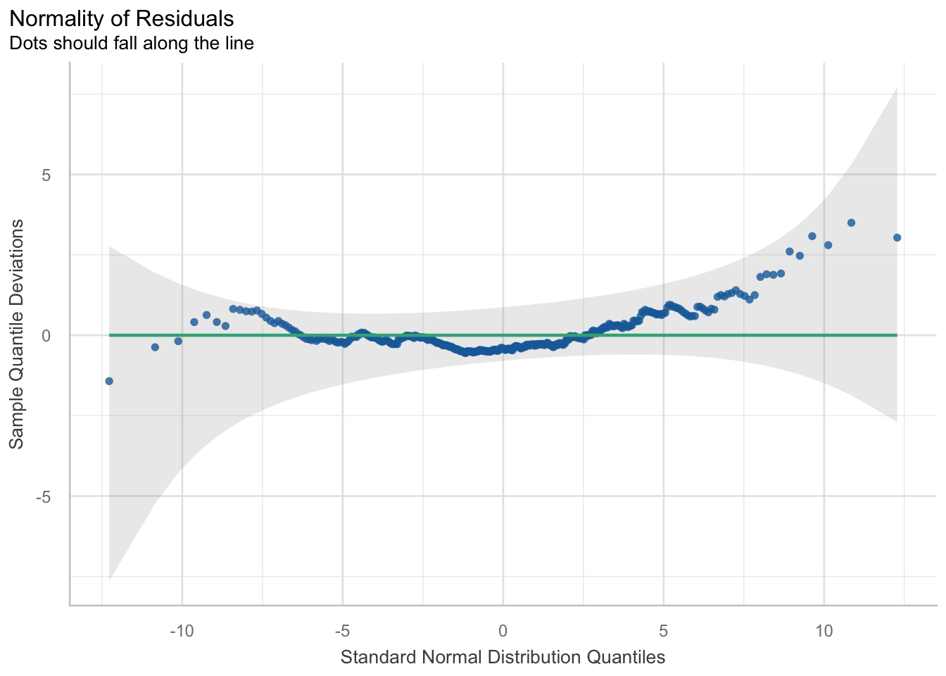
hist(resid(model6))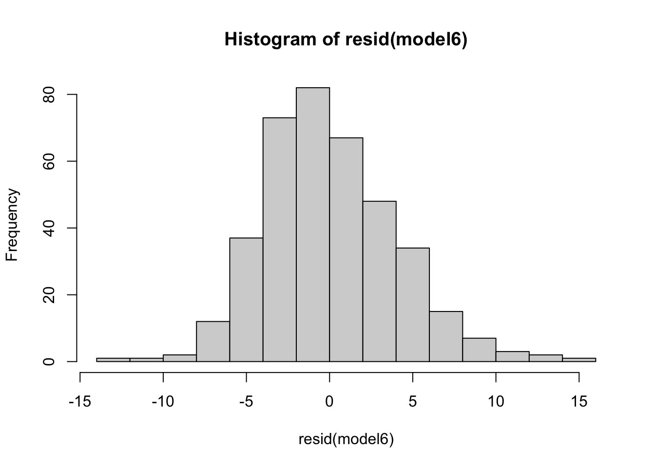
## we see a good model fit as indicated by the line crossing most of the data points
## it doesn’t fit the tails of the data too well. This indicates if values are much lower or higher than the average, the model doesn’t fit and predict the values well
Homoskedasticity
This assumption says that the variance in your data should be equal across the range of predicted values (Winter, 2014). For this assumption, we use a simple scatterplot of the fitted/predicted values against the residual values. There shouldn’t be any patterns, and the residuals should have roughly similar amounts of deviation from the predicted values.
plot(fitted(model6), resid(model6), abline(h = 0), ylim = c(-15, 15))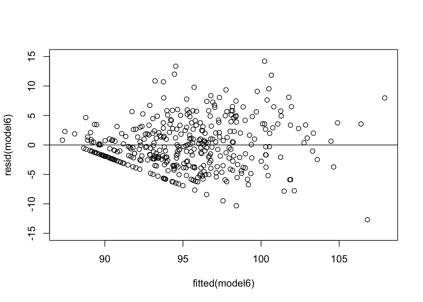
diagnostic_plots[[3]]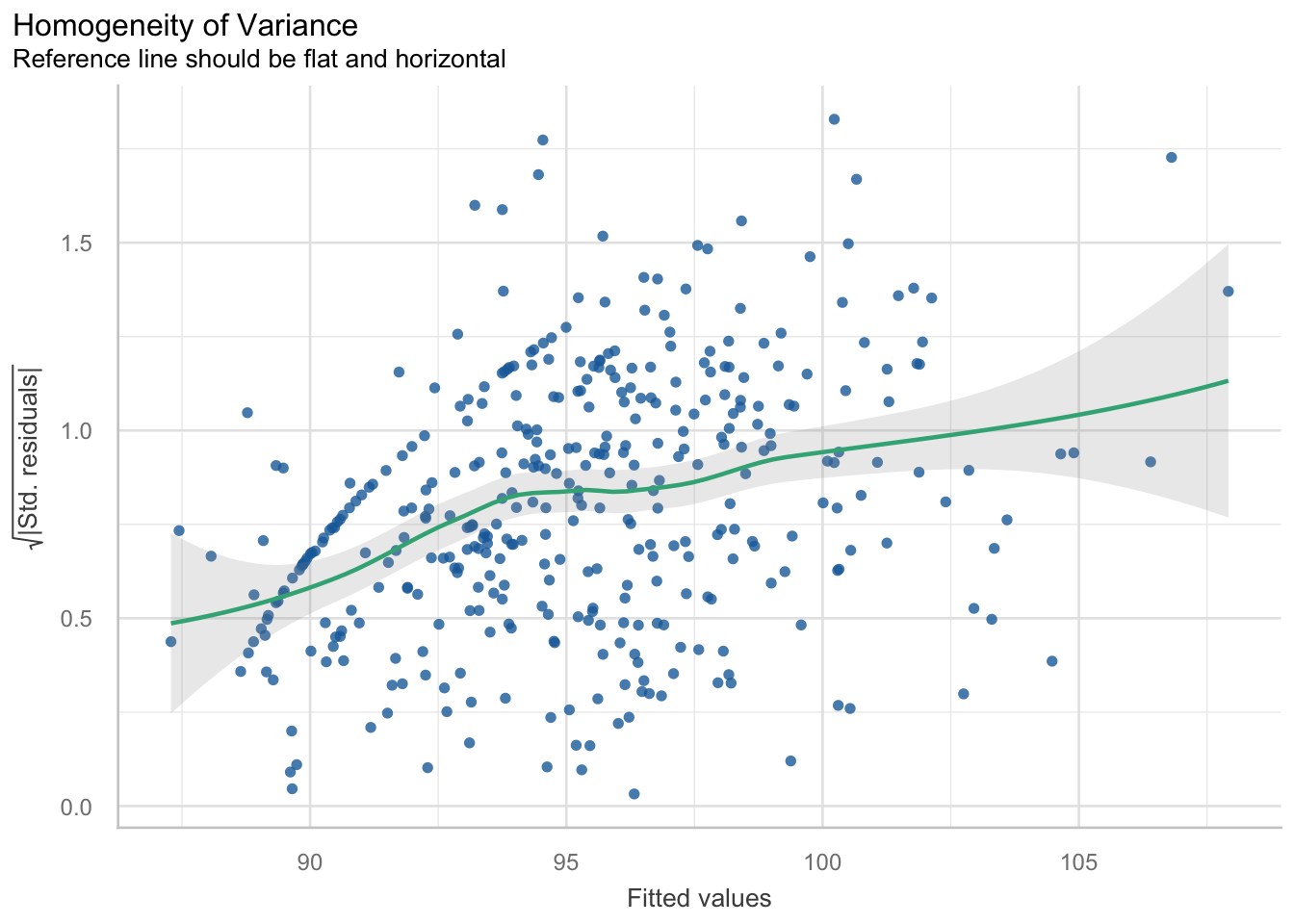
From this plot, we can see there is a pattern. The variance increases with the fitted values. That is, the residual variance fans out as the fitted values increase. This is a clear structural pattern that is indicating heteroskedasticity. There is also a strange pattern in one area of the plot, in the bottom left quadrant.
So, there is heteroskedasticity in the residuals of the model…

So, I played around with improving it using a different model construction. I used a lme model construction, which can cater for heteroskedastic variance structures. You can still specify fixed and random effects. However, the implicit assumption of using lme is that your random effect structures are nested (i.e. players play within a condition). Whilst this is true, I actually already assessed this in our null model constructions. It gave us a poorer baseline structure, so I didn’t continue with it. So whilst using the lme function may improve the heteroskedasticity partially and lower the AIC by a few points, there is a also a trade-off with the interpretability of using that model. That is, it is harder to interpret and use. I am going to continue to summarise our model using the already specified model6.
The second thing here is the pattern I mentioned before. What does this weird pattern mean? There is a density of points in a straight line. There is a systematic rise with the fitted values in this region (also meaning it’s not just pure random noise too). I am confident it is to do with the larger than normal amount of observations at 0 or 100 for Handball efficiency and/or Kick efficiency.
After some reading, it seems a pattern like this can form for a few reasons. Firstly, there is data that may explain this, but it is missing or hasn’t been modelled (i.e. there is a variable that I haven’t collected data on which may explain this). For example, it may be a grouping factor like position. Secondly, this ‘band’ of residuals may form from clusters of subjects or groups where the model hasn’t been able to capture the within-group variability. This may mean another random effect (i.e. random slope) is missing. Thirdly, this band may have formed because a categorical variable wasn’t included and the model considers a variable as categorical and then tries to ‘force-fit’ the levels into a linear trend. This may be the case as the model may be reading our HB and Kick efficiencies as categorical variables due to the high number of 0s and 100s. Furthermore, missing variables could include the age or experience of each player. Younger players may not position themselves in a way to receive more possessions, whereas older players may do this. As mentioned, it could potentially be the position of each player that is missing that may explain some of this variance… Do the coaches always start the play of drill with the defenders, or the midfielders, which influences Indegree Importance?
These small details may be overlooked but may influence longitudinal datasets and assist in explaining these results.
Consequently, I wanted to see if this was from one condition. Or potentially even one player. Or a group of players. So, I plotted the residuals versus fitted values and grouped it by condition AND player.
## plot residuals versus fitted by condition and player ----
residuals <- resid(model6)
fitted_val <- fitted(model6)

test <- data.frame(Fitted = fitted_val, Residuals = residuals, Condition = ind_df2$`Condition Identifier`,
                   Player = ind_df2$`Player ID`)

## By Condition
a <- ggplot(test, aes(x = Fitted, y = Residuals)) +
  geom_point() +
  geom_hline(yintercept = 0, linetype = "dashed", color = "red") + # Add horizontal line at 0
  labs(title = "Residuals vs. Fitted Values by Condition",
       x = "Fitted Values",
       y = "Residuals") +
  facet_wrap(~ Condition) +
  theme_bw() +
  theme(plot.title = element_text(size = 11),
        axis.title = element_text(size = 12),
        axis.text.y = element_text(size = 8),
        axis.text.x = element_text(size = 6))

## By Player
b <- ggplot(test, aes(x = Fitted, y = Residuals)) +
  geom_point(size = 0.5) +
  geom_hline(yintercept = 0, linetype = "dashed", color = "red") + # Add horizontal line at 0
  labs(title = "Residuals vs. Fitted Values by Player",
       x = "Fitted Values",
       y = "Residuals") +
  facet_wrap(~ Player) +
  theme_bw() +
  theme(plot.title = element_text(size = 11),
        axis.title = element_text(size = 12),
        axis.text.y = element_text(size = 4),
        axis.text.x = element_text(size = 4))

ggarrange(a,b)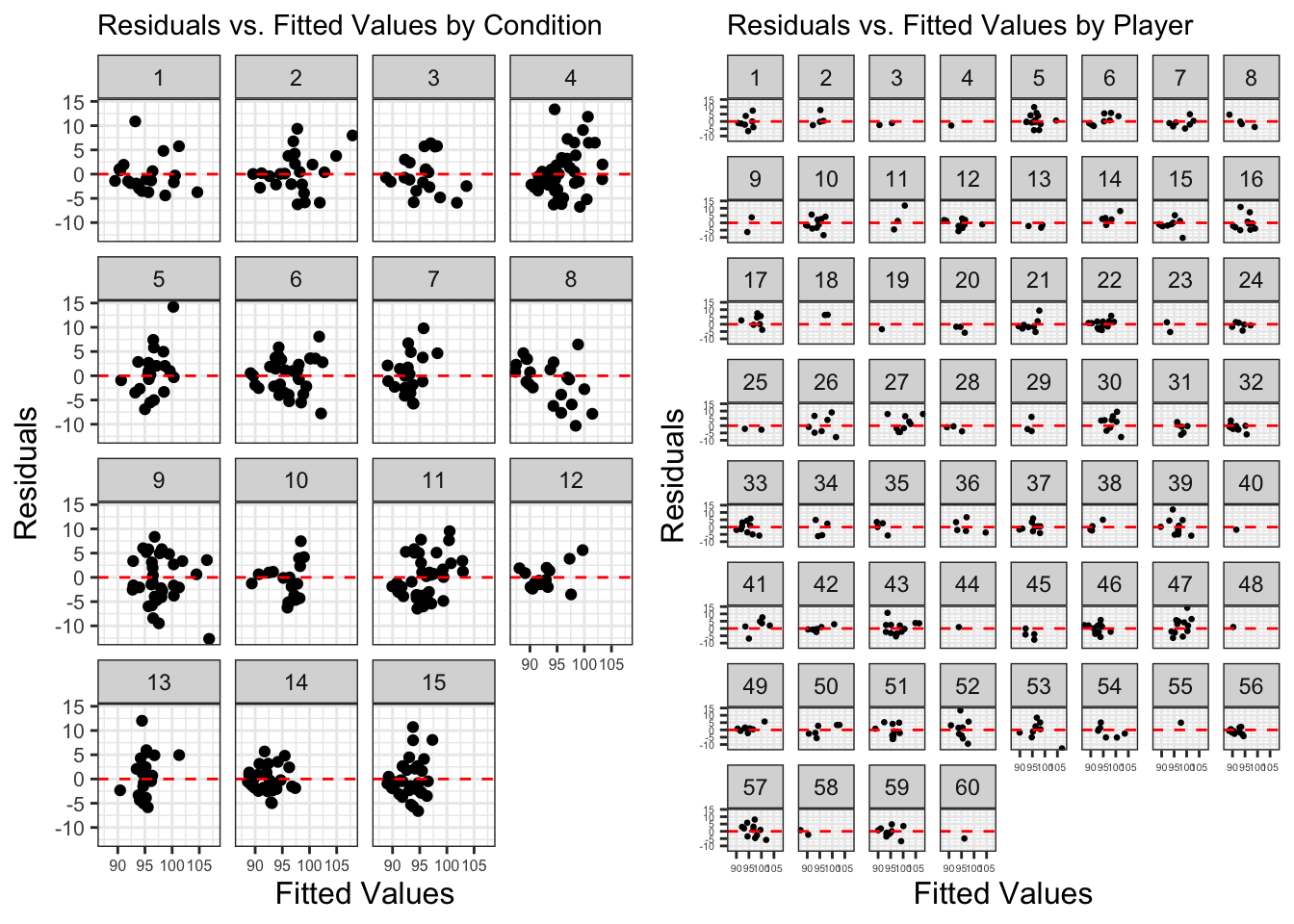
There doesn’t seem to be a clear or obviously consistent pattern from a pattern or a singular condition. But I’ve put down some notes below:
Condition 8 – the higher the fitted value, the higher the residual
Player 33 – rotated U shape in resid v fitted
Player 54 – exponential shape in resid v fitted
So, no specific condition or player is ‘responsible’ for this pattern it seems. Previously, we have identified influential values and retained them in the model as they are accurate and real values. Consequently, we will continue with our summary outputs.
Model summary, outputs and their meanings
We have finally arrived to our outputs and model summaries. It is quite a laborious process before arriving here, but this ensures higher quality and accurate results that we can trust and be confident in whilst reducing errors.
summary(model6)Linear mixed model fit by maximum likelihood . t-tests use Satterthwaite's
method [lmerModLmerTest]
Formula: indegree ~ marks + hb_eff + kick_eff + total_players + (1 | player) +
(1 | condition)
AIC BIC logLik -2*log(L) df.resid
2267.6 2299.2 -1125.8 2251.6 377
Scaled residuals:
Min 1Q Median 3Q Max
-2.9826 -0.5994 -0.1060 0.5823 3.3437
Random effects:
Groups Name Variance Std.Dev.
player (Intercept) 1.821 1.349
condition (Intercept) 1.552 1.246
Residual 18.068 4.251
Number of obs: 385, groups: player, 60; condition, 15
Fixed effects:
Estimate Std. Error df t value Pr(>|t|)
(Intercept) 83.330704 4.219558 15.598230 19.749 0.00000000000186 ***
marks 2.005660 0.212965 381.711281 9.418 < 0.0000000000000002 ***
hb_eff 0.027949 0.004996 382.995727 5.594 0.00000004226864 ***
kick_eff 0.014550 0.005926 369.385093 2.455 0.0145 *
total_players 0.368753 0.226322 15.102393 1.629 0.1239
---
Signif. codes: 0 '***' 0.001 '**' 0.01 '*' 0.05 '.' 0.1 ' ' 1
Correlation of Fixed Effects:
(Intr) marks hb_eff kck_ff
marks -0.027
hb_eff 0.008 -0.180
kick_eff -0.070 -0.299 0.008
total_plyrs -0.990 -0.012 -0.051 0.016r.squaredGLMM(model6) R2m R2c
[1,] 0.3577185 0.4587596# explains variance in the dataset then categorises by just fixed effects and entire model
## Tables and graphs
plot_model(model6, sort.est = TRUE, show.values = TRUE, dot.size = 1.5, value.offset = .2,
axis.labels = c("Kick Efficiency", "Handball Efficiency", "Total Players", "Marks"),
title = "Coefficient Estimates for Indegree Importance - Model6",
colors = "Black", vline.color = "Red")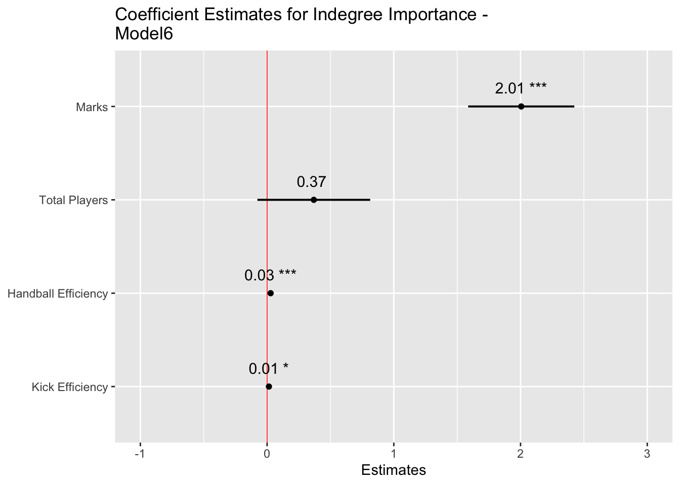
tab_model(model6, show.re.var = T, pred.labels = c("(Intercept)", "Marks", "Handball Efficiency", "Kick Efficiency", "Total Players"), dv.labels = "Effect on Indegree Importance")| Effect on Indegree Importance | |||
|---|---|---|---|
| Predictors | Estimates | CI | p |
| (Intercept) | 83.33 | 75.03 – 91.63 | <0.001 |
| Marks | 2.01 | 1.59 – 2.42 | <0.001 |
| Handball Efficiency | 0.03 | 0.02 – 0.04 | <0.001 |
| Kick Efficiency | 0.01 | 0.00 – 0.03 | 0.015 |
| Total Players | 0.37 | -0.08 – 0.81 | 0.104 |
| Random Effects | |||
| σ2 | 18.07 | ||
| τ00 player | 1.82 | ||
| τ00 condition | 1.55 | ||
| ICC | 0.16 | ||
| N player | 60 | ||
| N condition | 15 | ||
| Observations | 385 | ||
| Marginal R2 / Conditional R2 | 0.358 / 0.459 | ||
Model summary
We see our final model construction in the output. Firstly, we will go to our fixed effects. This table provides our model estimates, the standard error associated with each estimate, along with degrees of freedom, t values and its significance. Whilst we will provide enhanced information that contextualises the p values (i.e. the level of significance), publishing research in peer reviewed journals nearly mandates the usage of p values. Here, the null hypothesis is “the factors in the model do not influence Indegree Importance”. The mixed model shows that if this hypothesis were true, then the data would be unlikely. This is then interpreted as showing that the alternative hypothesis “factors in the model do influence Indegree Importance” is more likely and consequently that our result is statistically significant (i.e. p < 0.05). The “(Intercept)” line indicates our significance for the entire model (here p < 0.001). From there, each line indicates the significance for each fixed effect. Here, the p value in each row signifies where the coefficient to the left is significantly different from 0.
For the actual estimates with each included variable, every 1 mark a player takes is associated with a 2.01 (Confidence Interval (CI): 1.59-2.42) increase in indegree importance, every 1% increase in HB Efficiency is associated with a 0.03 (CI: 0.02-0.04) increase, every 1% increase in kick efficiency is associated with a 0.01 increase (CI: 0.00-0.03) and for every one additional player included in the drill, Indegree Importance increases by 0.37 (CI: -0.08-0.81). Each coefficient is a positive value. These are the fixed (systematic) effects on Indegree Importance.
R Squared and the variance explained
The multiple R squared function refers to the statistic R2 and is a measure of the “variance explained” (Winter, 2014). Our R2 numbers are 0.358 and 0.459 for marginal and conditional variance explained, respectively. Here, the marginal R2 represents the variance explained by the fixed effects only, whereas the conditional represents the variance explained by the entire model (i.e. fixed AND random effects). We can interpret this as the model saying it explains 36% of the stuff happening in our dataset with our fixed effects only, and 46% when we can adjust it for player and condition level idiosyncrasies.
Values can range from 0 to 1, with higher values explaining more variance in the dataset. We would like values to be high, but we may not attain them because sport can be messy and complex. So, what we received here from our model is a pretty decent level of variance explained from only a few fixed effects and catering for individual and condition level differences.
Plotting predicted values
We will now plot the predicted values for each of our fixed effects. The plots will show the predicted relationship between each fixed effect and Indegree Importance. Each plot will have a reference line (i.e. the black dashed line) that shows the average for Indegree Importance, so we can see whether increases in that variable are practically meaningful.
We will use the plot_model function from the sjPlot package and combine it with ggplot2 so we can write in a lot more functionality.
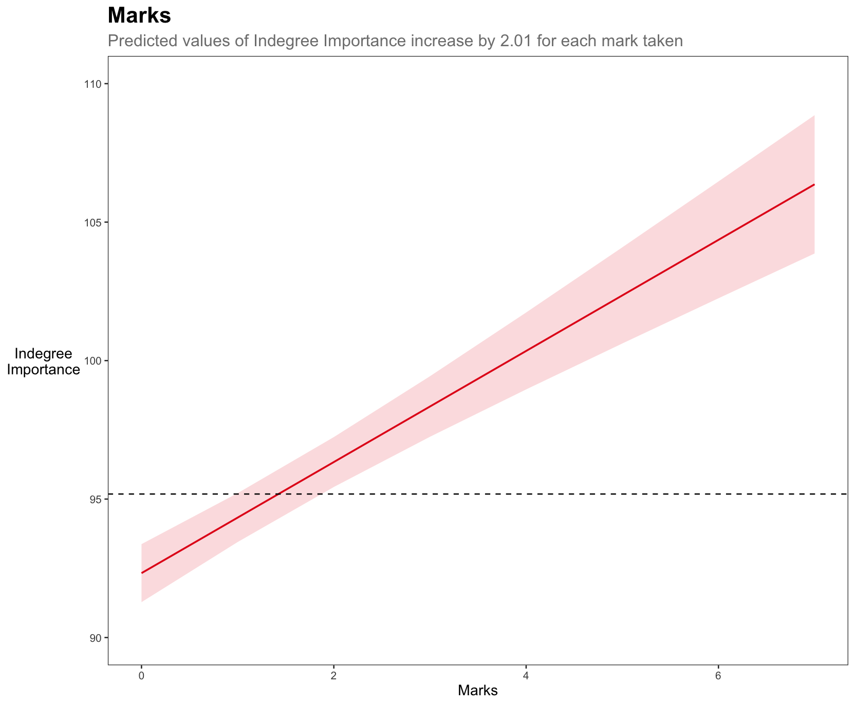
a <- plot_model(model6, type = "pred", terms = "marks") +
  theme_bw() +
  labs(title = "Marks",
       subtitle = "Predicted values of Indegree Importance
increase by 2.01 for each mark taken",
       x = "Marks", y = "Indegree
Importance") +
  coord_cartesian(ylim = c(90, 110)) +
  geom_hline(yintercept = mean(ind_df2$`Indegree Quotient Score`),
             linetype = "dashed",
             colour = "black") +
  theme(plot.title = element_text(size = 10, face = "bold"),
        plot.subtitle = element_text(colour = "grey50", size = 8),
        axis.title.y = element_text(vjust = 0.5, angle = 0),
        axis.title = element_text(size = 8),
        panel.grid.major = element_blank(),
        panel.grid.minor = element_blank())

b <- plot_model(model6, type = "pred", terms = "hb_eff") +
  theme_bw() +
  labs(title = "Handball Efficiency (%)",
       subtitle = "Predicted values of Indegree Importance
increase by 0.03 for each 1% increase in HB %",
       x = "Handball Efficiency (%)", y = "") +
  coord_cartesian(ylim = c(90, 110)) +
  geom_hline(yintercept = mean(ind_df2$`Indegree Quotient Score`),
             linetype = "dashed",
             colour = "black") +
  theme(plot.title = element_text(size = 10, face = "bold"),
        plot.subtitle = element_text(colour = "grey50", size = 8),
        axis.title.y = element_blank(),
        axis.title = element_text(size = 8),
        panel.grid.major = element_blank(),
        panel.grid.minor = element_blank())

c <- plot_model(model6, type = "pred", terms = "kick_eff") +
  theme_bw() +
  labs(title = "Kick Efficiency (%)",
       subtitle = "Predicted values of Indegree Importance
increase by 0.01 for each 1% increase in Kick %",
       x = "Kick Efficiency (%)", y = "Indegree
Importance") +
  coord_cartesian(ylim = c(90, 110)) +
  geom_hline(yintercept = mean(ind_df2$`Indegree Quotient Score`),
             linetype = "dashed",
             colour = "black") +
  theme(plot.title = element_text(size = 10, face = "bold"),
        plot.subtitle = element_text(colour = "grey50", size = 8),
        axis.title.y = element_text(vjust = 0.5, angle = 0),
        axis.title = element_text(size = 8),
        panel.grid.major = element_blank(),
        panel.grid.minor = element_blank())

d <- plot_model(model6, type = "pred", terms = "total_players") +
  theme_bw() +
  labs(title = "Number of Players",
       subtitle = "Predicted values of Indegree Importance
increase by 0.37 for each additional player in the drill",
       x = "Total Number of Players", y = "") +
  coord_cartesian(ylim = c(90, 110)) +
  geom_hline(yintercept = mean(ind_df2$`Indegree Quotient Score`),
             linetype = "dashed",
             colour = "black") +
  theme(plot.title = element_text(size = 10, face = "bold"),
        plot.subtitle = element_text(colour = "grey50", size = 8),
        axis.title.y = element_blank(),
        axis.title = element_text(size = 8),
        panel.grid.major = element_blank(),
        panel.grid.minor = element_blank())

## combine all plots and add heading
combined <- ggarrange(a,b,c,d)
annotate_figure(combined, top = text_grob("Plotting the Predicted Values for Indegree Importance",
                                          color = "black", face = "bold", size = 13))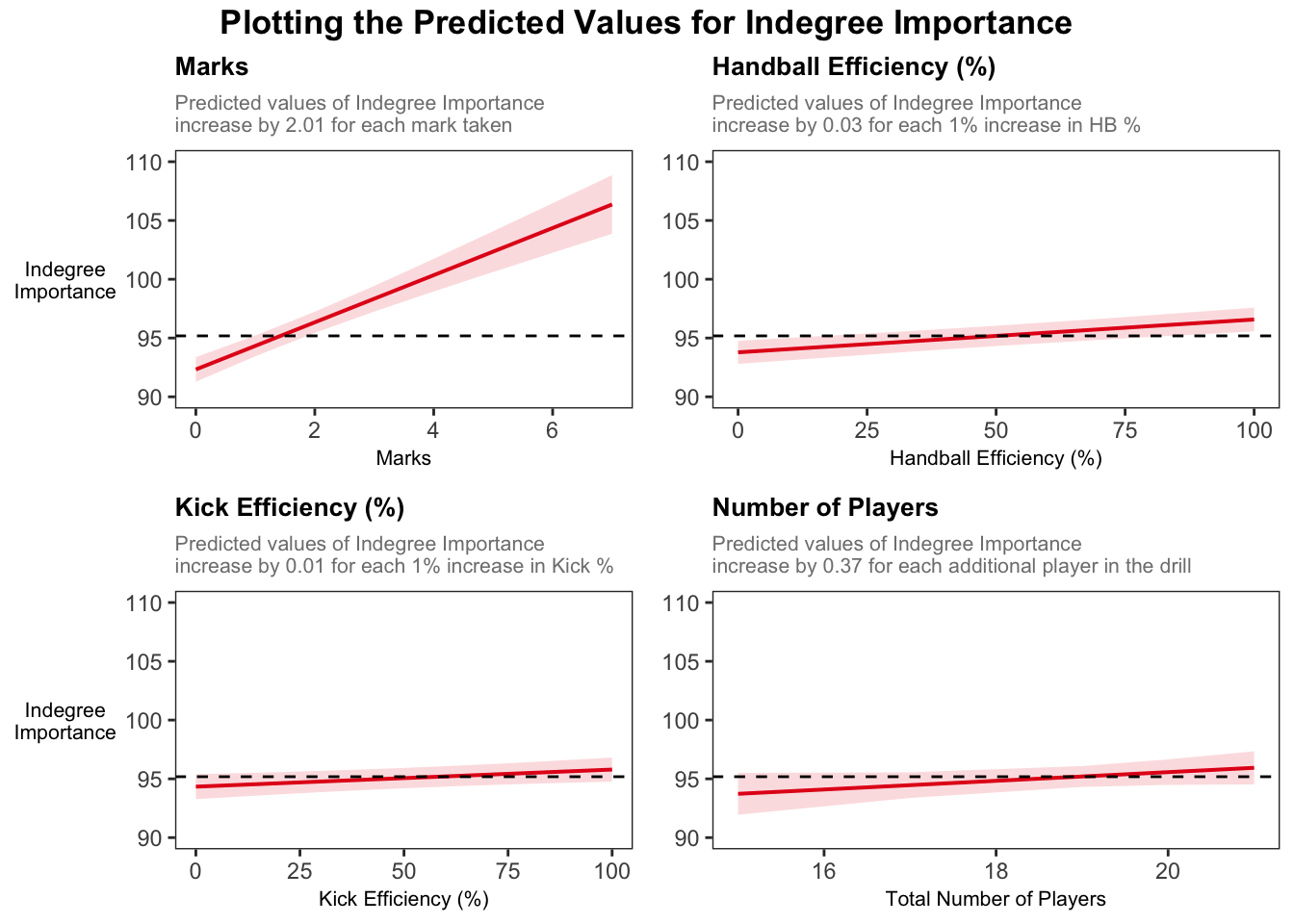
Visually, we can see the stronger effect of marks on Indegree Importance values. For example, if a player takes 2 marks, they will have an around average Indegree value. If they take 2 more marks, they will be near a value of 105 for Indegree Importance, showing their higher level of importance in this passing network.
These graphs provide an appealing visual that compares our fixed effect variables and their predicted influence on Indegree Importance values.
What about the random effects?
Remember that including random effects was necessary and allowed us to resolve the inter-dependent observations (i.e. repeated measures from individuals and related measures within each condition). Consequently, there is a different ‘baseline’ for each player and the related observations within conditions.
Assessing the random effects helps us try to understand which part of the system ‘holds’ more variance. In our case here, the variance for player is 1.82 with a standard deviation of 1.35, compared to the variance for condition which is 1.55 with a standard deviation of 1.25. The larger variance for player means individual level differences contribute more to the overall outcome variability than condition differences. Additionally, the lower the variance, the more ‘uniform’ the differences in each condition. The graphs below demonstrate the random intercepts by player and by condition, respectively.
The residual standard deviation is 18.07, which represents the variability that’s not due to either player or condition, or the random deviations from the predicted values that are not attributed to either player or condition (i.e. the residual represents the variability in Indegree Importance that is not explained by the model).
# use this code to easily generate random effects visualisations
plot_model(model6, type = "re", title = "Random Effects",
           colors = c("#98a0a2", "#083e51"), show.intercept = T, axis.lim = c(-4,4),   dot.size = 2, line.size = 0.5)
[[1]]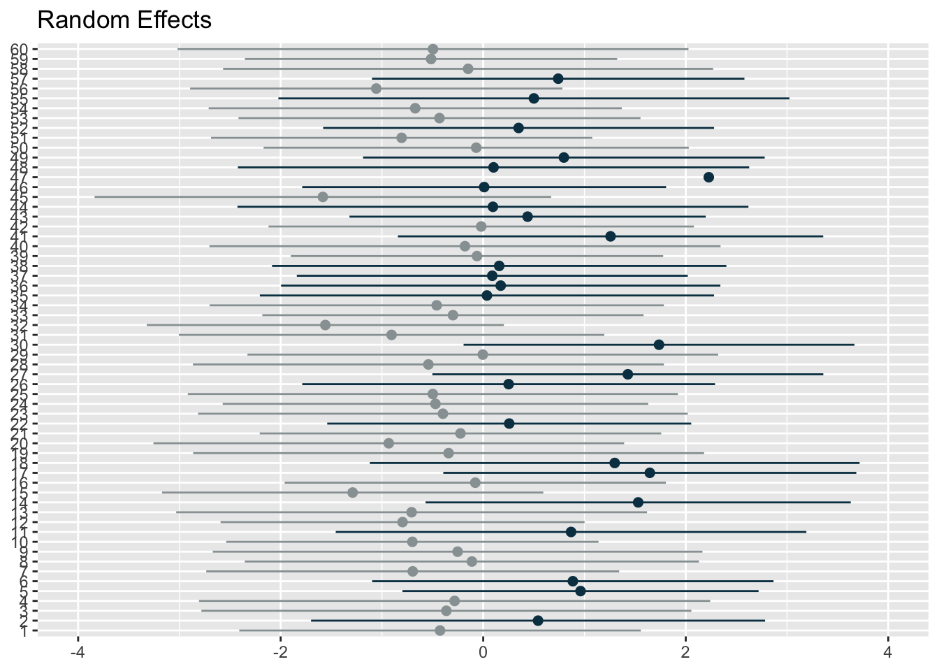
[[2]]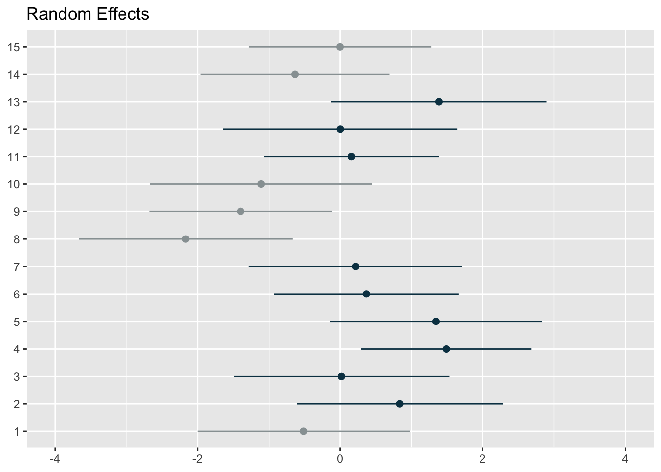
The first graph represents the player level random effects (n=60) whilst the second represents the condition level random effects (n=15). You can use the above code from the sjPlot package to plot random effects, but I wanted more flexibility. So, I extracted the random effect numbers and changed the colours of points and their confidence intervals if the interval crossed 0. I thought it was a more effective and flexible way to visualise the effects.
### use ranef() function to generate our random effect intercepts
ranef_list <- get_model_data(model6, type = "re") # get random effects data from model
ranef_df1 <- as.data.frame(ranef_list[1]) # extract 1st element from list
ranef_df2 <- as.data.frame(ranef_list[2]) # extract 2nd element from list
ranef_df <- rbind(ranef_df1, ranef_df2)
ranef_df <- ranef_df %>%
  mutate(group = ifelse(str_detect(facet, "player"), "player", "condition"))

## add column grouping if the confidence intervals cross 0
# do for visualisation
ranef_player <- ranef_df %>%
  filter(group == "player") %>%
  mutate(crosses_zero = conf.low <= 0 & conf.high >= 0)

ranef_condition <- ranef_df %>%
  filter(group == "condition") %>%
  mutate(crosses_zero = conf.low <= 0 & conf.high >= 0)

## ranef by condition
ggplot(ranef_condition, aes(x = estimate, y = reorder(term, estimate))) +
  theme_bw() +

  geom_segment(
  aes(x = conf.low, xend = conf.high,
      yend = term),
  colour = ifelse(ranef_condition$crosses_zero == TRUE, "grey70", "#2F4B7C"),
  linewidth = 1.2, alpha = 0.5
) +
  geom_point(
    aes(x = estimate),
    shape = 21,
    size = 4,
    fill = ifelse(ranef_condition$crosses_zero == TRUE, "grey70", "#2F4B7C"),
    colour = "black"
  ) + geom_vline(xintercept = 0, colour = "black", linetype = "dashed", size = 0.5) +
  labs(title = "Condition specific deviations show three conditions with purely positive or negative values",
       subtitle = "The grey colours represent conditions where the confidence intervals cross 0",
       y = "Condition",
       x = "Estimate with 95% confidence intervals") +
theme(axis.title.y = element_text(vjust = 0.5, angle = 0),
        plot.title = element_text(size = 10, face = "bold"),
        plot.subtitle = element_text(colour = "grey50", size = 9),
        axis.title = element_text(size = 10))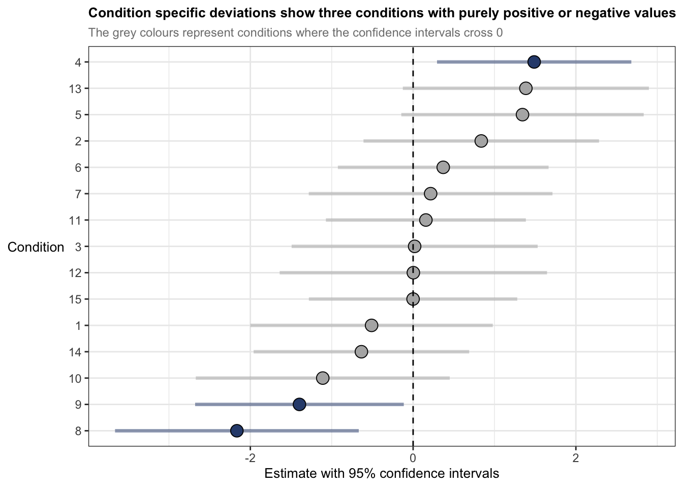
ggplot(ranef_player, aes(x = estimate, y = reorder(term, estimate))) +
  theme_bw() +

  geom_segment(
    aes(x = conf.low, xend = conf.high,
        yend = term),
    colour = ifelse(ranef_player$crosses_zero == TRUE, "grey70", "#2F4B7C"),
    linewidth = 1.2, alpha = 0.5
  ) +
  geom_point(
    aes(x = estimate),
    shape = 21,
    size = 2,
    fill = ifelse(ranef_player$crosses_zero == TRUE, "grey70", "#2F4B7C"),
    colour = "black"
  ) + geom_vline(xintercept = 0, colour = "black", linetype = "dashed", size = 0.5) +
  labs(title = "Player specific deviations in Indegree show 1 player with a purely positive effect",
       subtitle = "The grey colours represent players where the confidence intervals cross 0",
       y = "Player",
       x = "Estimate with 95% confidence intervals") +
  theme(axis.title.y = element_text(vjust = 0.5, angle = 0),
        plot.title = element_text(size = 10, face = "bold"),
        plot.subtitle = element_text(colour = "grey50", size = 9),
        axis.title = element_text(size = 10),
        axis.text.y = element_text(size = 5))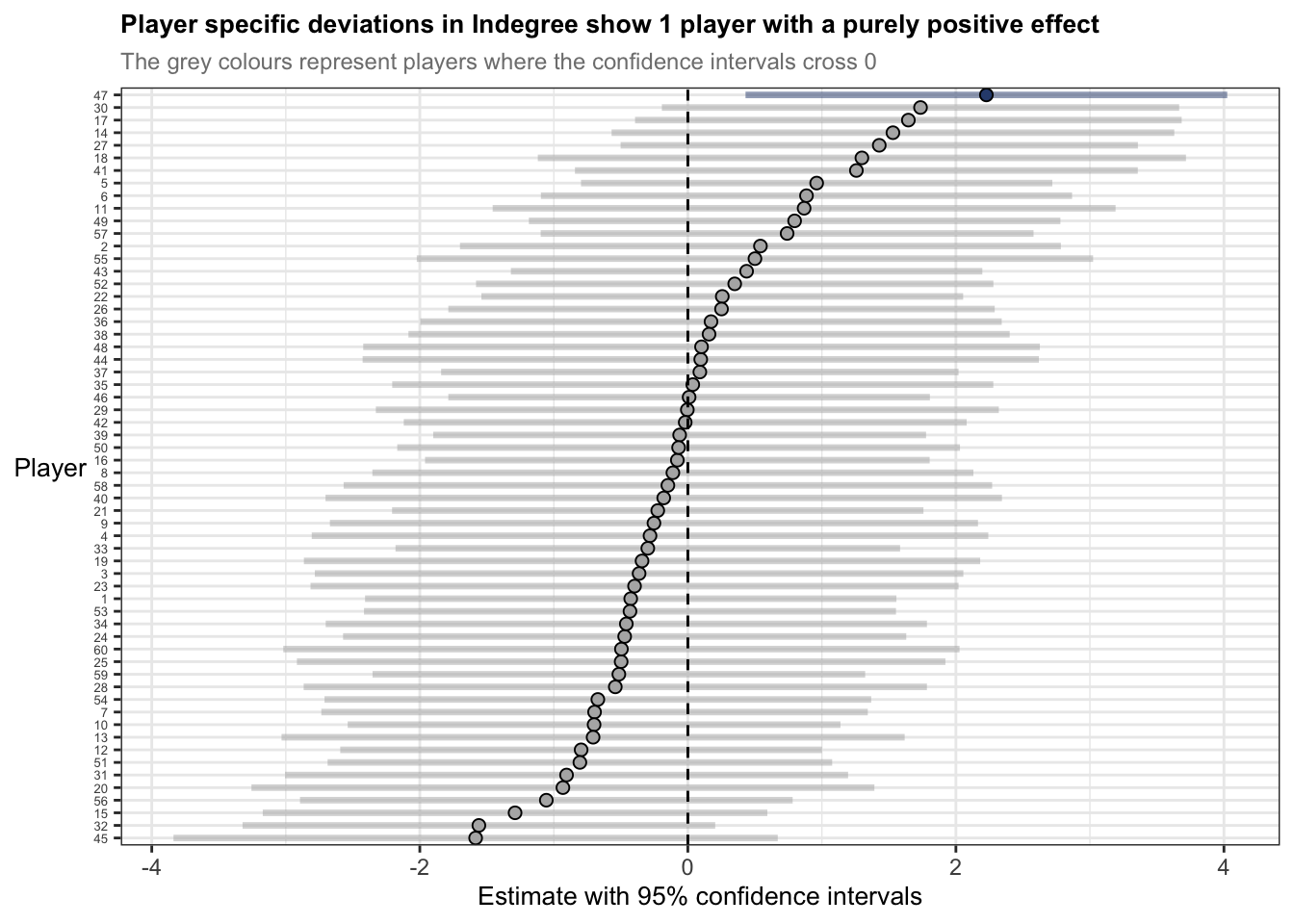
The statements previously discussed about the random effects summaries indicate that players are more like themselves than they are with other people – of course this is intuitive. But now we understand a bit more about to what degree and specifically, how players may have different baselines for Indegree Importance. For example, player 47s estimate is 2 points above 0, whereas player 45s estimate is nearly -2 points below 0. Here, if we want to influence player 45s baseline estimate, we could incorporate some manipulations into the practice environment. For example, we could change the starting position of player 45 at the beginning of the training activity or allocate more space to him in a subtle way, where this increased space makes him a viable passing option, so he takes a mark or is under less pressure so produces effective passes. I’ve discussed these sort of manipulations before using the constraints-led approach.
The inclusion of the random effects has helped partition the variance between the player and condition and the fixed effects. We also saw this when looking at R2 measures and how much variance was explained by our model (remember it was 36% for just the fixed effects and 46% for fixed AND random effects).
Effect sizes
Effect sizes are used to quantify the magnitude of a relationship between two variables or the difference between two groups. Effect sizes provide extremely useful information on top of previously flagged significance and estimates of each coefficient. They are more applicable to indicate the ‘practical significance’ of each predictor variable. Because effect sizes are standardised measures using the mean and standard deviation, we can also compare across research studies or internal projects too.
To calculate the effect sizes for mixed models in R, we will use the parameters (Lüdecke et al., 2020) and effectsize (Ben-Shachar et al. 2020) packages. These packages compute and extract parameters from the mixed model and convert t values into partial eta squared values (t values are the statistic we generated from our summary() function). Note that the code below generates an approximation for the effect sizes – they are not exact. Effect sizes are generated using partial eta squared (η2). The interpretations are 0.01 (small), 0.06 (moderate) and 0.14 (large) (Cohen, 1988).
param_model6 <- parameters(model6, effects = "fixed")
effects_model6 <- t_to_eta2(param_model6$t, df_error = param_model6$df_error, ci = 0.95)

## Outputs
param_model6
# Fixed Effects
Parameter | Coefficient | SE | 95% CI | t(377) | p
-------------------------------------------------------------------------
(Intercept) | 83.33 | 4.22 | [75.03, 91.63] | 19.75 | < .001
marks | 2.01 | 0.21 | [ 1.59, 2.42] | 9.42 | < .001
hb eff | 0.03 | 5.00e-03 | [ 0.02, 0.04] | 5.59 | < .001
kick eff | 0.01 | 5.93e-03 | [ 0.00, 0.03] | 2.46 | 0.015
total players | 0.37 | 0.23 | [-0.08, 0.81] | 1.63 | 0.104
Uncertainty intervals (equal-tailed) and p-values (two-tailed) computed
using a Wald t-distribution approximation.effects_model6Eta2 (partial) | 95% CI
-----------------------------
0.51 | [0.45, 1.00]
0.19 | [0.14, 1.00]
0.08 | [0.04, 1.00]
0.02 | [0.00, 1.00]
6.99e-03 | [0.00, 1.00]
- One-sided CIs: upper bound fixed at [1.00].I have manually put the results including the effect sizes into a table.
| Coefficients | 95% Confidence intervals | df | t value | Likelihood ratio test | AIC Diff | Effect size (η2) | |
|---|---|---|---|---|---|---|---|
| Fixed effects | |||||||
| (Intercept) | 83.33 | 75.03-91.63 | 377 | 19.75 | p < 0.001 | 0.51 (0.45-1 | |
| Marks | 2.01 | 1.59-2.54 | 9.42 | p < 0.001 | 107 | 0.19 (0.14-1 | |
| Handball Efficiency | 0.03 | 0.02-0.04 | 5.59 | p < 0.001 | 28 | 0.08 (0.04-1 | |
| Kick Efficiency | 0.01 | 0.00-0.03 | 2.45 | p = 0.015 | 4 | 0.02 (0.00-1) | |
| Total Players | 0.37 | -0.08-0.81 | 1.63 | p = 0.104 | 1 | 0.01 (0.00-1 |
Marks has a large effect size (η2 = 0.19) whilst HB efficiency has a moderate effect (η2 = 0.08). Kick efficiency and total number of players are both small effects (η2 = 0.02 & 0.01) with confidence intervals that span every possible value (i.e. 0 up until 1). It seems R has defaulted to the known maximum within confidence intervals for effect sizes (i.e. the value 1) due to issues with the non-centrality parameter, which is especially the case with small sample sizes or weak effects. Consequently, it seems these variables do not provide much practical utility when reflected using effect sizes.
Nonetheless, effect sizes in linear mixed models can be calculated and used as a tool to help understand the magnitude of importance and ‘practical significance’.
In hindsight…
The outputs of the model suggest that I probably shouldn’t have kept the ‘Total Number of Players’ as a fixed effect. It improved the predictive power of the model (i.e. reduced the model AIC value compared to the previous), but it wasn’t significantly different. But upon seeing the coefficients, the confidence intervals and effect sizes, it suggests that it isn’t very useful for application. Food for thought for future analyses. I would remove this in future analyses but I’ll keep it here for posterity…
Wrapping up
When I first started learning and using linear mixed models during my PhD, there wasn’t much material related to their usage in sport. I was lucky enough to have a great supervisor in Job Fransen who has great statistical knowledge. However, there were always problems or unknowns on how to do things, what packages to use, what limits or thresholds to use etc. It can be a difficult and laborious process.
For this reason, I wrote these articles (Read part 1 here) to show how to build and interpret mixed models to practitioners or researchers working with sports data. Moreover, I wanted to give more detail in particular areas where practitioners in sport may not put as much attention into because of time restraints or lack of knowledge in statistical concepts, e.g. checking assumptions in the data before data analysis and again post model construction. I hope the articles assist with your models in the future.
Reach out if you’ve got any questions or suggestions on anything!
Note: The information presented here is by no means exhaustive. And although I have performed multiple mixed models for research, I am no specialist. If there are things or considerations you think are important or there are errors in the code, please let me know.
References and useful readings
Newans T, Bellinger P, Drovandi C, Buxton S, Minahan C. (2022). The utility of mixed models in sport science: A call for further adoption in longitudinal data sets. Int J Sports Phys Perf.
Harrison et al. (2018), A brief introduction to mixed effects modelling and multi-model inference in ecology. PeerJ 6:e4794; DOI 10.7717/peerj.4794
Nagakawa, S & Schielzeth, H. 2013, A General and Simple Method for Obtaining R2 from Generalized Linear Mixed-Effects Models, Methods in Ecology and Evolution, 4(2), 133-142.
Bodo Winter, A very basic tutorial for performing linear mixed effects analyses: Tutorial 1 & Tutorial 2:
https://bodowinter.com/tutorial/bw_LME_tutorial1.pdf https://bodowinter.com/tutorial/bw_LME_tutorial2.pdfBates D, Maechler M, Bolker B, Walker S. 2015. Fitting linear mixed-effects models using lme4. J Stat Softw. 67(1):1–48. doi:10.18637/jss.v067.i01.
Ben-Shachar MS, Makowski D, Lüdecke D. 2020. Compute and interpret indices of effect size. CRAN. accessed August 2020 https://github.com/easystats/effectsize
Cohen J. 1988. Statistical power analysis for the behavioural sciences. 2nd ed. Hillsdale (NJ): Lawrence Erlbaum Associates
Kuznetsova A, Brockhoff PB, Christensen RHB. 2017. lmerTest package: tests in linear mixed effects models. J Stat Softw. 82(13):1–26. doi:10.18637/jss.v082.i13.
“Plotting mixed model outputs”, Patrick Ward, accessed 12th February 2026, https://optimumsportsperformance.com/blog/plotting-mixed-model-outputs/
▲ Back to top