library(readxl)       # import excel file
library(tidyverse)    # general data wrangling
library(viridis)      # colour palettes
library(fields)       # create legend for plot
library(Matrix)       # build matrix
library(igraph) # for general network-related manipulations and plotSocial networks in sport
Team sport
Performance analysis
Data
Network analysis
Short read (5 mins)
Australian football
Use social networks to display multiple levels of information about the team
Social networks are a powerful way to showcase multiple dynamic elements of sports performance. This guide will show you how to collect and structure the data to produce an appealing and informative visual.
NoteTL;DR
- What are social networks in sport: they are representations of interactions between players, where the interactions are effective passes
- How and why: We can create a visually appealing and informative visual, that shows within-team network structure, key contributors and overall team behaviour in matches and/or training
- Impact of social networks: Social network metrics and graphs can be used to inform decision-making processes on tactics, player evaluations and training design
TipDownloadable file of the article
Estimated reading time: ~5 minutes
What are social networks?
The interaction of group members and the relationships between members within a team can be quantified. This is social network analysis (also known as complex network analyses or passing network analysis). In sport, we can analyse the passing sequences between the team members and visualise the interactions between players over a game. For those who are Simpsons fans, Kent Brockman can give us some insight.
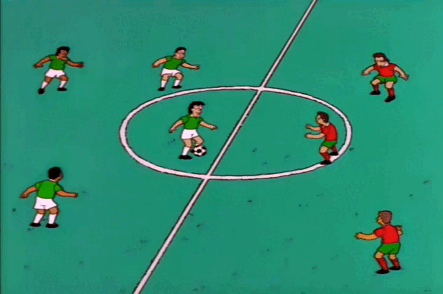

Half back passes to the centre, back to the wing, back to the centre… centre holds it, holds it, holds it…
Kent Brockman – Season 9, Episode: “The Cartridge Family”
This small piece from The Simpsons Kent Brockman is essentially describing what a social network is. He is describing who is passing to who. We want to do what he is doing, but through data.
While I will not go into the depths of specific metrics within social network analyses, this approach can supplement traditional metrics and re-conceptualise what performance means from a more dynamic perspective (Ribeiro et al., 2017). Additionally, this reconceptualization that teams are a social network places players as nodes, that are connected through an informational exchange, i.e. passing, which results in patterns of interaction with other teammates. A simple graph is below (Figure 1).
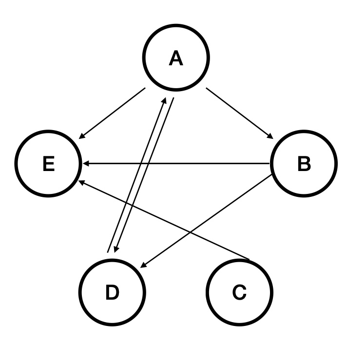
How to build a social network visualisation in R?
We must first start with what is called an adjacency matrix. This matrix provides us with this weird, complex table of numbers but crucially, it quantifies the number of interactions or passes that each member of the team has completed, and with who.
I have put together an excel file for those wanting to follow along. There are instructions included within the file in the first sheet along the top. There are four tables, (1) for the passing list, (2) for allocating player names to an ID number, (3) a reactive adjacency matrix for team 1 and (4) a reactive adjacency matrix for team 2. There are two tables for adjacency matrices if you are collecting training data and have two teams opposing each other.
📄 Download excel template with example data
We manually code using our passing list (Figure 2), which then (using excel functions) is coded into an adjacency matrix (Figure3). Once we have an adjacency matrix that has some passes and connections in it, we import it into R.
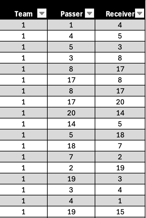
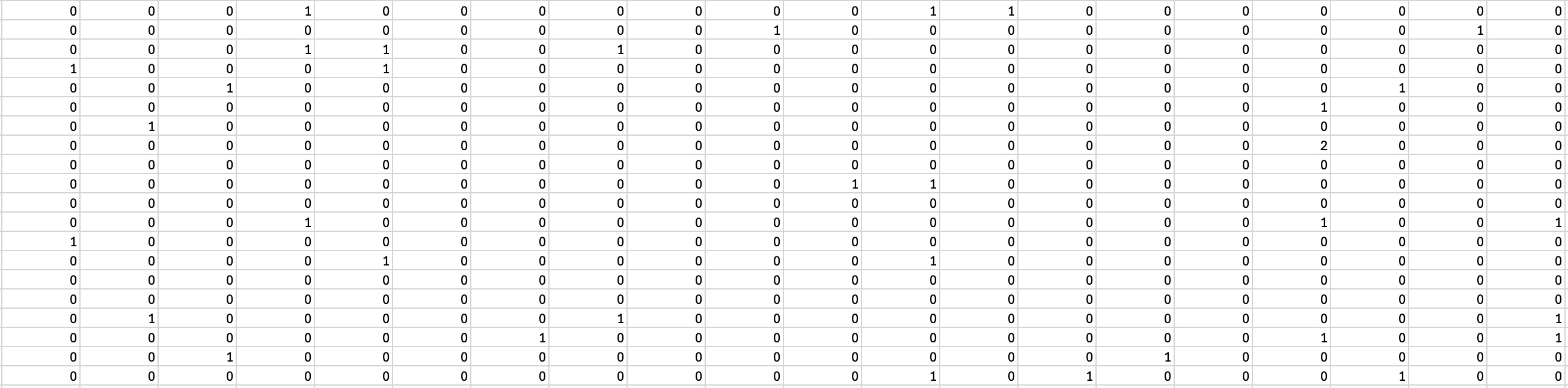
The excel file above has an example passing list already in it (Figure 2), which we will use to build the plot above. We will import the second sheet from the file (Figure 3). This sheet has the pure adjacency matrix. First, let’s load the packages we need in R.
Here, we will load the data into R, rename variables (this can be done however you’d like) then convert it to an adjacency matrix.
team1 <- read_excel("Adjacency_Matrix_Rhys_Tribolet.xlsx", sheet = 2, col_names = FALSE) # colnames must be false
rownames(team1) <- colnames(team1) <- c("A","B","C","D","E","F","G","H","I","J","K","L","M","N","O","P","Q","R","S","T")
team1 <- as.matrix(team1)
We then use the igraph package to make a graph object from the adjacency matrix.
graph_obj_weighted <- igraph::graph_from_adjacency_matrix(team1, mode = "directed", weighted = TRUE)We make an edge list from the graph object,
edge_list <- igraph::as_data_frame(graph_obj_weighted, what = "edges")

edge_list2 <- edge_list %>%
  rowwise() %>%
  mutate(pair = paste(sort(c(from, to)), collapse = "-"))
get the paired sums of each interaction,
pair_sums <- edge_list %>%
  rowwise() %>%
  mutate(pair = paste(sort(c(from, to)), collapse = "-")) %>%
  ungroup() %>%
  group_by(pair) %>%
  summarise(interactions = sum(weight))
then join pair_sums dataframe onto the edge list. We must join each of these together to get the edges/passes aligned with each node, i.e. player. This ensures each pass is aligned with the actual player that made it or received it.
edge_list3 <- edge_list2 %>%
  left_join(pair_sums, by = "pair")
Lastly, we assign a variable to the number of interactions. This is needed later to assign weights to the lines and arrows (i.e. their technical name is edges) in our plot.
E(graph_obj_weighted)$weight <- edge_list3$weightBuild our plot
Now, we can use the igraph package to construct our plot.
The baseline plot looks something like this.
plot(graph_obj_weighted)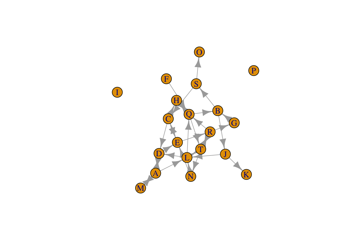
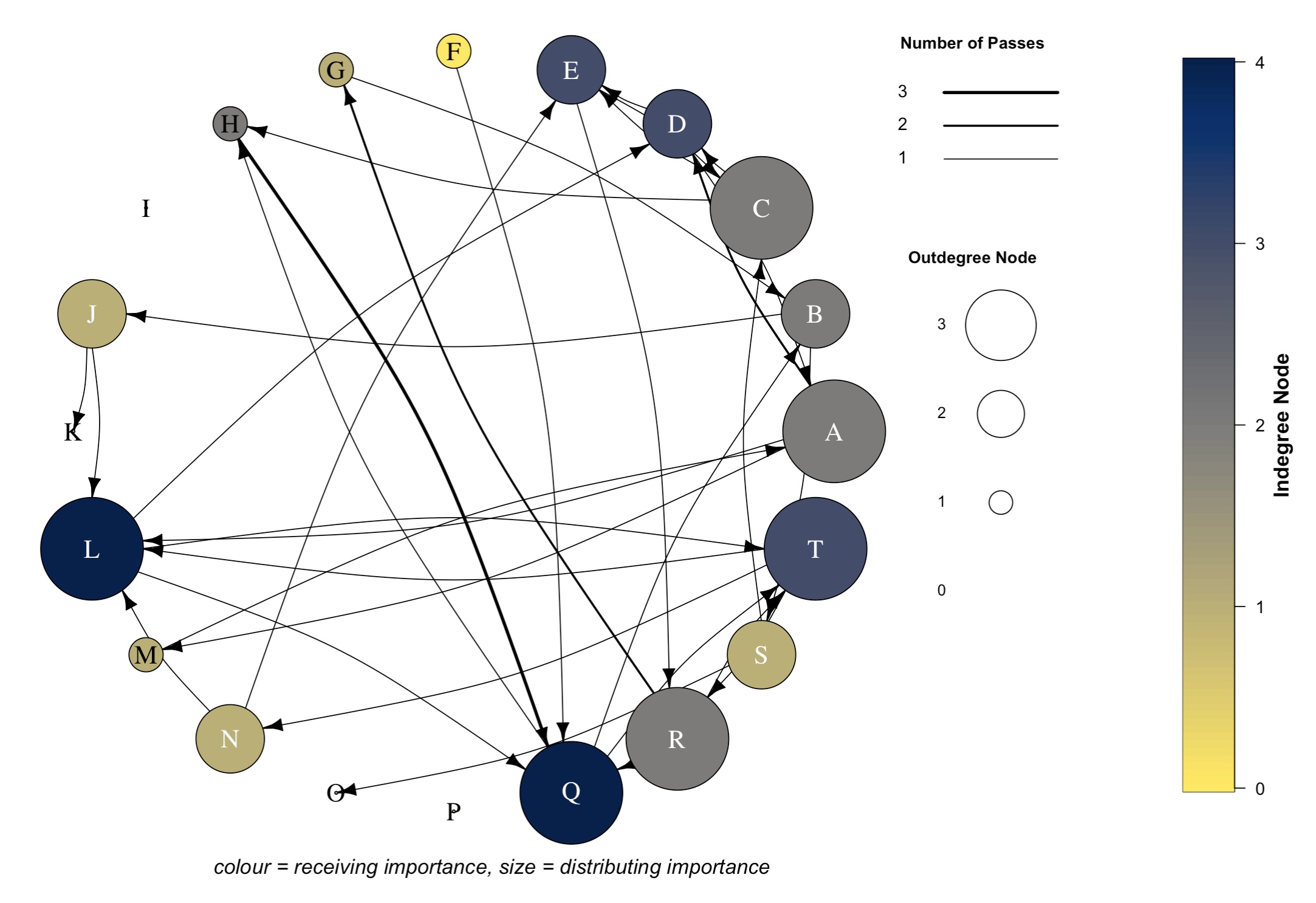
# This graph does change each time you run this line of code though, so this layout will be different to yours. As you can see, it is hard to ascertain much information from this graph. But we can add layers to the plot, so we can specify a range of characteristics. Using these layers, I later manipulate the size and colour of the nodes, the arrow/edge width, add a curvature to the edges and alter the actual layout of the graph (i.e. circular). I also manipulate the node labels using a rule. But first, we must specify our colour palette based on social network data. This data is generated from our raw adjacency matrix (team1 variable).
Specify colour palette
Here, we specify the colour palette for our nodes and what values we assign to it. I chose to scale the colours according to a social network metric called Indegree Node, which is a value assigned to each player showing the number of players they receive passes from. It reflects how many players have successfully reached them within the network. You can change this to whichever metric you like (e.g. betweenness, incloseness, outcloseness, centrality node etc).
## create outdegree and indegree node values
## indegree node colour palette
## specify our values for Indegree node
## direction -1 changes the scale, so that darker colours = higher values, and lighter colours = lower values
## options for colour palletes = https://cran.r-project.org/web/packages/viridis/vignettes/intro-to-viridis.html

outdeg_node <- rowSums(team1 != 0)
indeg_node <- colSums(team1 != 0)
col_pal <- cividis(max(indeg_node) + 1, direction = -1) # colour palette name is cividis
vertex_col <- col_pal[indeg_node + 1]
Now, lets plot!
# -----
## Plot
# -----
plot(graph_obj_weighted,
     vertex.color = vertex_col,
     vertex.size = outdeg_node*9,
     vertex.label.cex = 1.5,
     vertex.label.color = ifelse(
       outdeg_node <= 1,
        "black", "white"),
     edge.color = "black",
     edge.arrow.size = 0.5,
     layout=layout_in_circle(graph_obj_weighted),
     edge.curved = 0.15,
     edge.width = E(graph_obj_weighted)$weight)
text(0.1, -1.15, "colour = receiving importance, size = distributing importance", font = 3, cex = 1.2)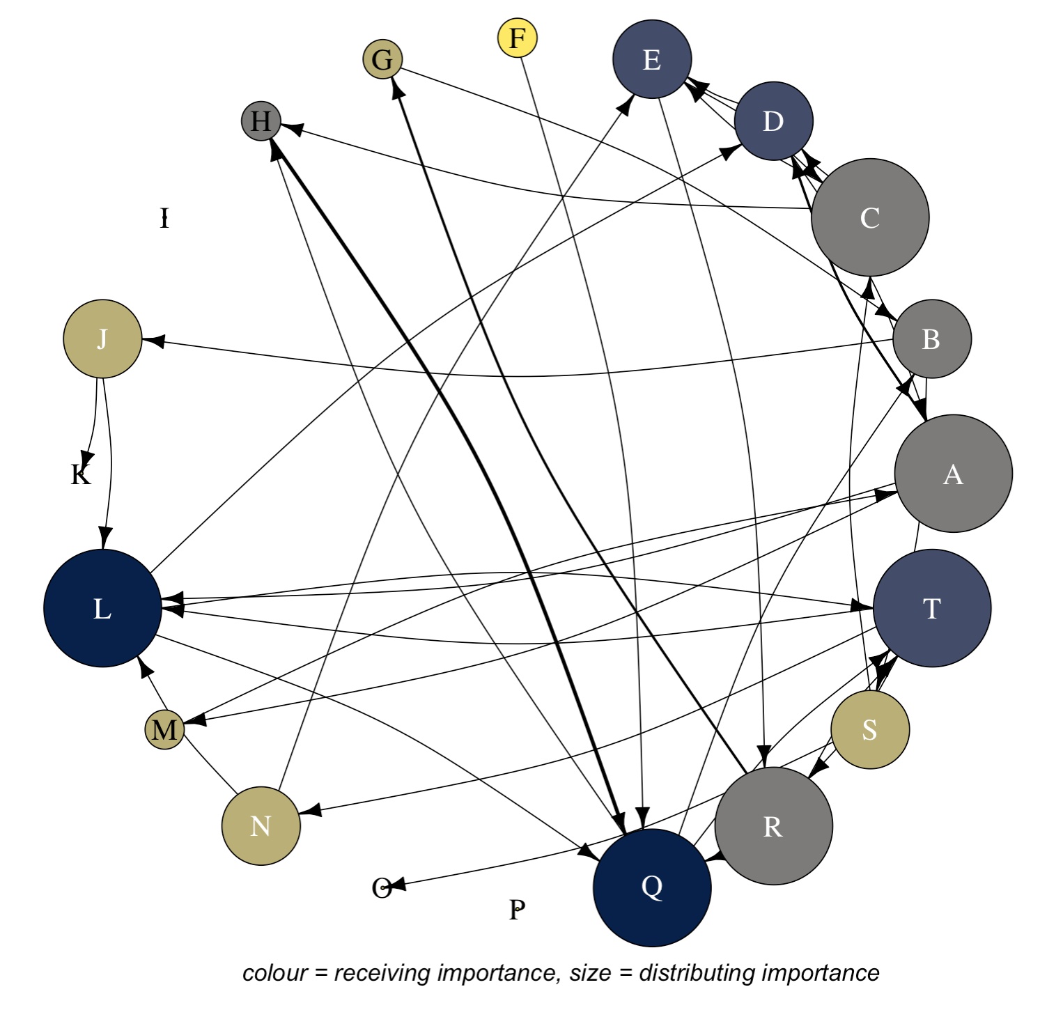
Okay, already we can see a much more appealing graph that conveys more information. To here, the vertex/node colour represents a metric that shows a players receiving importance, the node/vertex size represents a metric that shows the players distributing importance and the edges/lines represent weighted passes (i.e. darker lines indicate more passes between those two players). General other features here include adding curvature to the edges/lines, the circular layout and the text down the bottom.
Next, we construct and insert our colour bar scale/legend.
# -----
## Plot
# -----
plot(graph_obj_weighted,
     vertex.color = vertex_col,
     vertex.size = outdeg_node*9,
     vertex.label.cex = 1.5,
     vertex.label.color = ifelse(
       outdeg_node <= 1,
        "black", "white"),
     edge.color = "black",
     edge.arrow.size = 0.5,
     layout=layout_in_circle(graph_obj_weighted),
     edge.curved = 0.15,
     edge.width = E(graph_obj_weighted)$weight)
text(0.1, -1.15, "colour = receiving importance, size = distributing importance", font = 3, cex = 1.2)

# ------------------
## Colour bar/legend
# ------------------
pal_nodes <- cividis(100, direction = -1) ## create node pallete with vridis package, direction argument changes the direction of the colour scale
V(graph_obj_weighted)$indegree <- degree(graph_obj_weighted, mode = "in") ## specify indegree values from graph matrix
vals <- V(graph_obj_weighted)$indegree ## assign to vals
tick_vals <- pretty(range(vals), n = 5)
image.plot(legend.only=TRUE, zlim=range(vals), col=pal_nodes, legend.lab = expression(bold("Indegree Node")), legend.cex = 1.2) 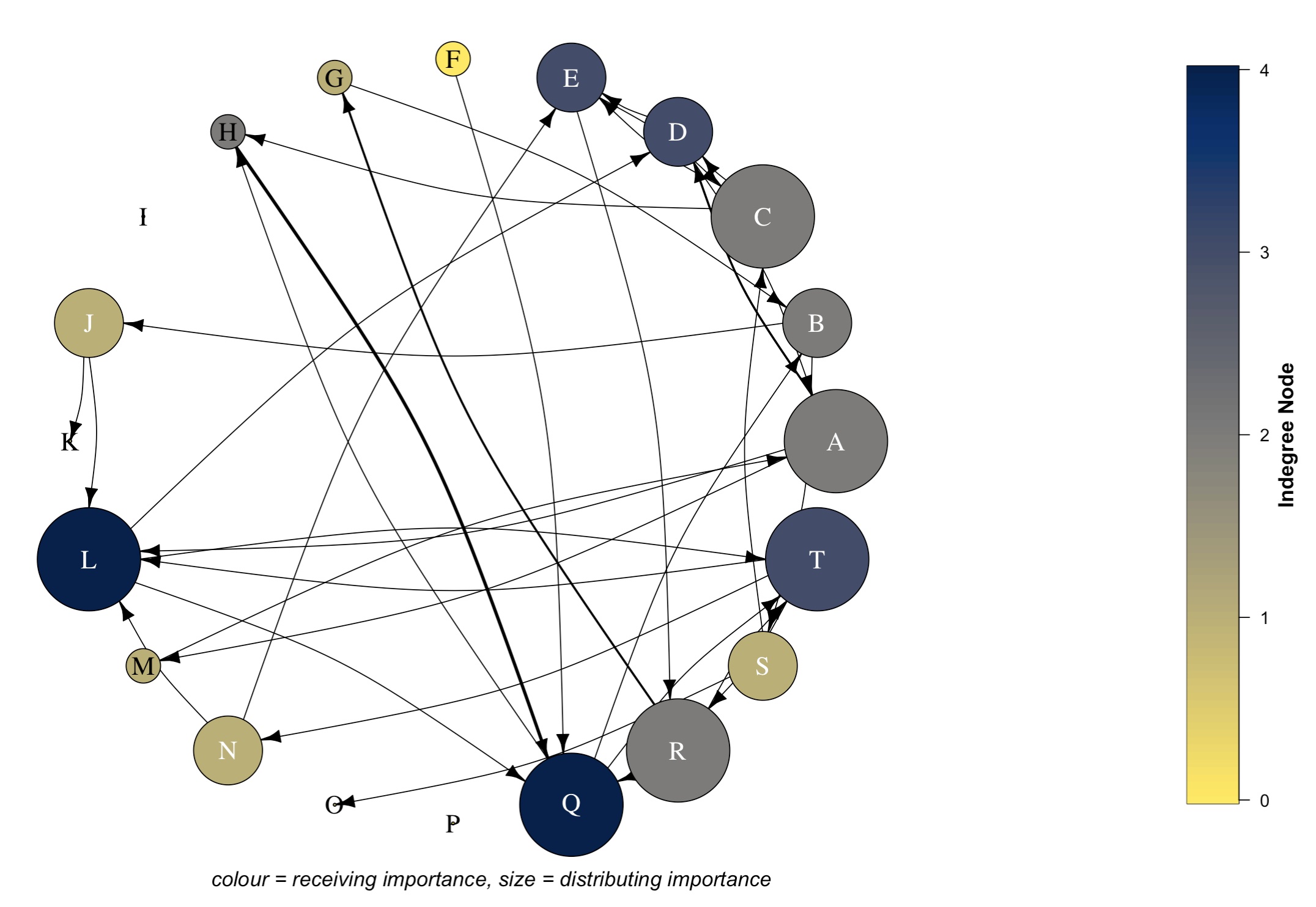
Edge width legend
Now, we build our edge width (arrow thickness) scale/legend.
# -----
## Plot
# -----
plot(graph_obj_weighted,
     vertex.color = vertex_col,
     vertex.size = outdeg_node*9,
     vertex.label.cex = 1.5,
     vertex.label.color = ifelse(
       outdeg_node <= 1,
        "black", "white"),
     edge.color = "black",
     edge.arrow.size = 0.5,
     layout=layout_in_circle(graph_obj_weighted),
     edge.curved = 0.15,
     edge.width = E(graph_obj_weighted)$weight)
text(0.1, -1.15, "colour = receiving importance, size = distributing importance", font = 3, cex = 1.2)

# ------------------
## Colour bar/legend
# ------------------
pal_nodes <- cividis(100, direction = -1) ## create node pallete with vridis package
V(graph_obj_weighted)$indegree <- degree(graph_obj_weighted, mode = "in") ## specify indegree values from graph matrix
vals <- V(graph_obj_weighted)$indegree ## assign to vals
tick_vals <- pretty(range(vals), n = 5)
image.plot(legend.only=TRUE, zlim=range(vals), col=pal_nodes, legend.lab = expression(bold("Indegree Node")), legend.cex = 1.2)

# -------------
## Edge legend
# -------------
edge_vals <- sort(unique(edge_list3$weight))

# Specify the position for the 3 lines
ys <- c(0.8, 0.9, 0.1) ## set position of the lines based off the number of edge values too
## if more passes/interactions, then add here

# Create segments and corresponding length and width according to edge values (edge_vals)
segments(
  x0 = 0.8, y0 = ys,
  x1 = 1.0, y1 = ys,
  lwd = edge_vals)
text(0.7, ys, labels = edge_vals, cex = 1, pos = 4, offset = 0.5)
text(0.85, 1.15, "Number of Passes", font = 2, cex = 0.95)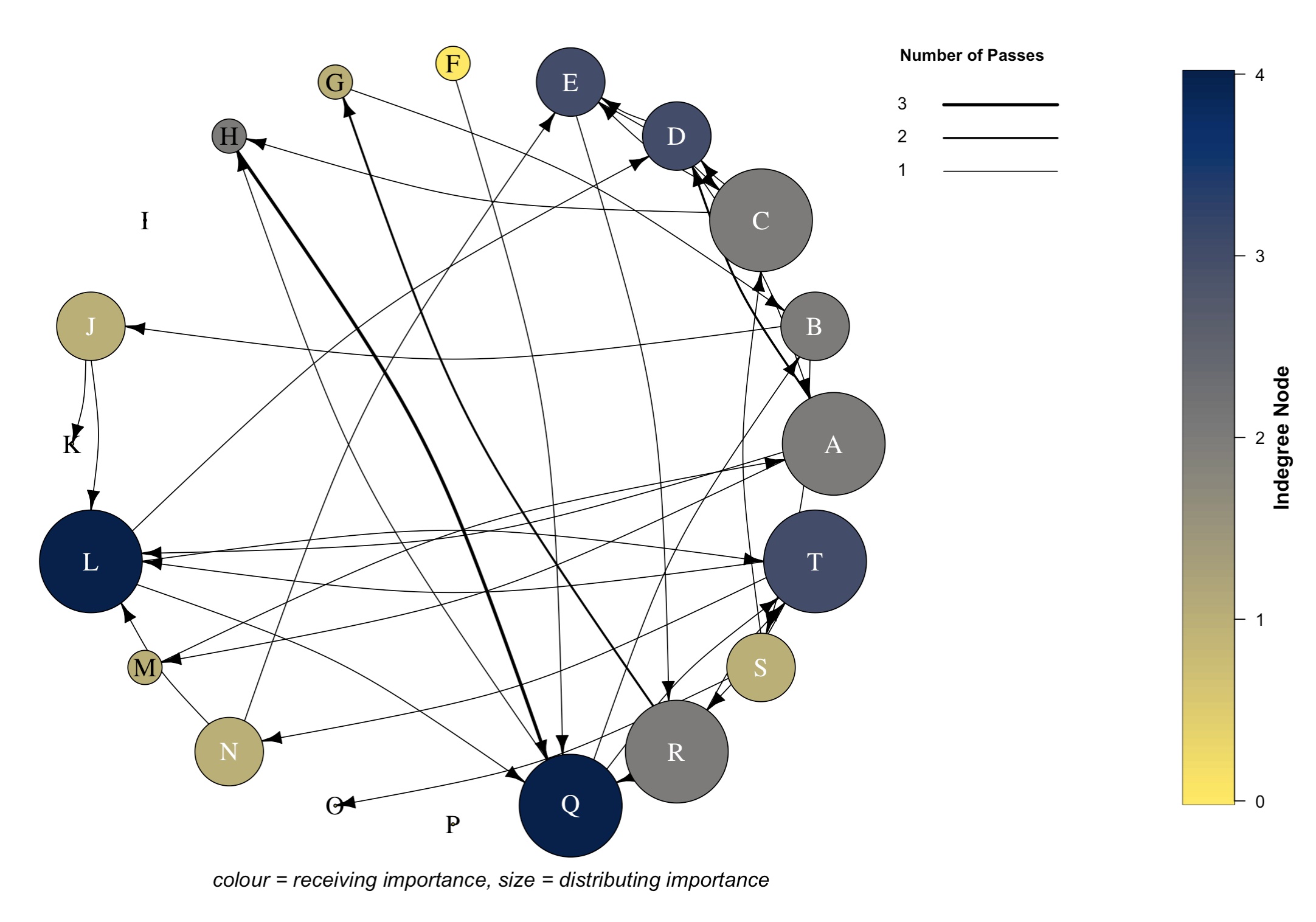
Node size legend
Whilst it wasn’t part of my original plan, I also included a node size legend too. I’m still unsure on how it fits with everything, but you can be the judge.
# -----
## Plot
# -----
plot(graph_obj_weighted,
     vertex.color = vertex_col,
     vertex.size = outdeg_node*9,
     vertex.label.cex = 1.5,
     vertex.label.color = ifelse(
       outdeg_node <= 1,
        "black", "white"),
     edge.color = "black",
     edge.arrow.size = 0.5,
     layout=layout_in_circle(graph_obj_weighted),
     edge.curved = 0.15,
     edge.width = E(graph_obj_weighted)$weight)
text(0.1, -1.15, "colour = receiving importance, size = distributing importance", font = 3, cex = 1.2)

# ------------------
## Colour bar/legend
# ------------------
pal_nodes <- cividis(100, direction = -1) ## create node pallete with vridis package
V(graph_obj_weighted)$indegree <- degree(graph_obj_weighted, mode = "in") ## specify indegree values from graph matrix
vals <- V(graph_obj_weighted)$indegree ## assign to vals
tick_vals <- pretty(range(vals), n = 5)
image.plot(legend.only=TRUE, zlim=range(vals), col=pal_nodes, legend.lab = expression(bold("Indegree Node")), legend.cex = 1.2)


# -------------
## Edge legend
# -------------
edge_vals <- sort(unique(edge_list3$weight))

# Specify the position for the 3 lines
ys <- c(0.8, 0.9, 0.1) ## set position of the lines based off the number of edge values
## if more passes/interactions, then add here

# Create segments and corresponding length and width according to edge values (edge_vals)
segments(
  x0 = 0.8, y0 = ys,
  x1 = 1.0, y1 = ys,
  lwd = edge_vals)
text(0.7, ys, labels = edge_vals, cex = 1, pos = 4, offset = 0.5)
text(0.85, 1.15, "Number of Passes", font = 2, cex = 0.95)

# --------------
## Node legend
# --------------
node_vals <- pretty(range(outdeg_node), n = 3)
node_sizes <- node_vals * 30

# x/y positions
xs <- rep(0.9, length(node_sizes))
ys <- seq(-0.5, 0.3, length.out = length(node_sizes))

# draw example nodes
points(xs, ys, pch = 21, bg = "white", cex = node_sizes / 10)

# add labels
text(0.77, ys,
     labels = node_vals,
     cex = 0.9,
     pos = 4)
text(0.85, 0.5,  "Outdegree Node", font = 2, cex = 0.95)
And voila! We have our final graph/visual that shows a weighted social network. What this graph now shows:
Bigger nodes indicate a player has a greater level of distributing importance. Node size represents the outdegree node values (i.e. number of players that each player has made passes to).
Darker nodes indicate a player has a greater level of receiving importance. Node colour represents indegree node values (i.e. number of players that each player has received passes from).
Thicker edges/lines indicate a stronger passing relationship between two players. Edge width/arrow thickness represents the number of passes between each respective node/player.
The curvature in our edges ensures we can see bi-directional interactions
The arrowhead shows the direction of the pass, i.e. who they passed to
From this graph, we could infer the following:
Key receivers: D, E , L, Q, T
Key distributers/passers: A, D, L, Q, T
Hybrid (both receive and distribute possession): D, L, Q, T
Minimal importance in the network: F, K, O
Bees dick away from being baked by a coach: I, P
Notes: H & Q share strong relationship
Conclusion
Once we have collected our pass-by-pass data using the excel template provided, we can import our adjacency matrix into R. From there, we can create a number of social network metrics that reflect different passing behaviours in our team and visualise these behaviours to create an appealing and informative visual to help assess individual and team performance. This could inform decision-making on things such as player and team reviews, tactical strategy, longitudinal player and team development and opposition tactics and behaviours, to name a few.
Let me know if you have any questions or need clarification on anything. I’d be interested to hear if you use a different way to visualise social network data and how that has been interpreted by other practitioners and/or coaches.
Cheers, Rhys
References
Ribeiro, J., Silva, P., Duarte, R., Davids, K. & Garganta, J. (2017), Team Sports Performance Analysed Through the Lens of Social Network Theory: Implications for Research and Practice, Sports Med, 47, 1689-1696.
▲ Back to top